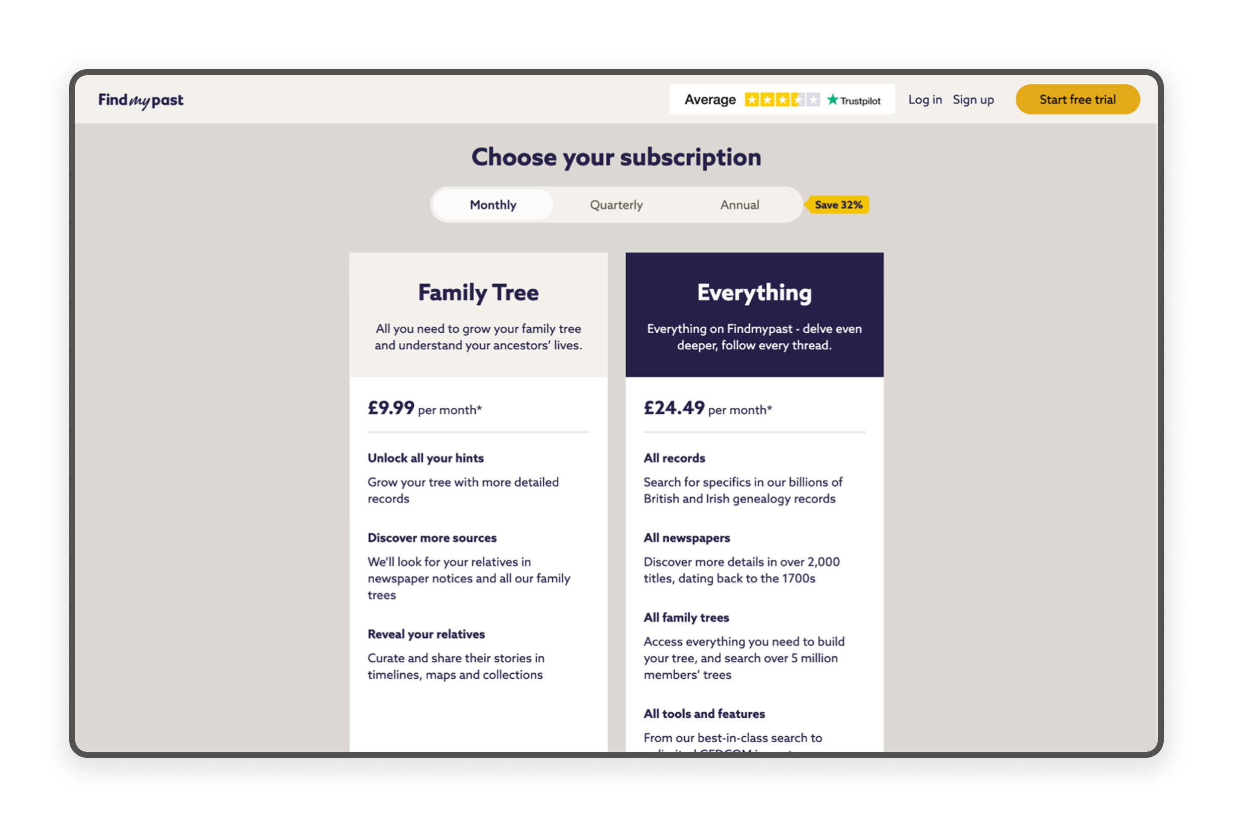
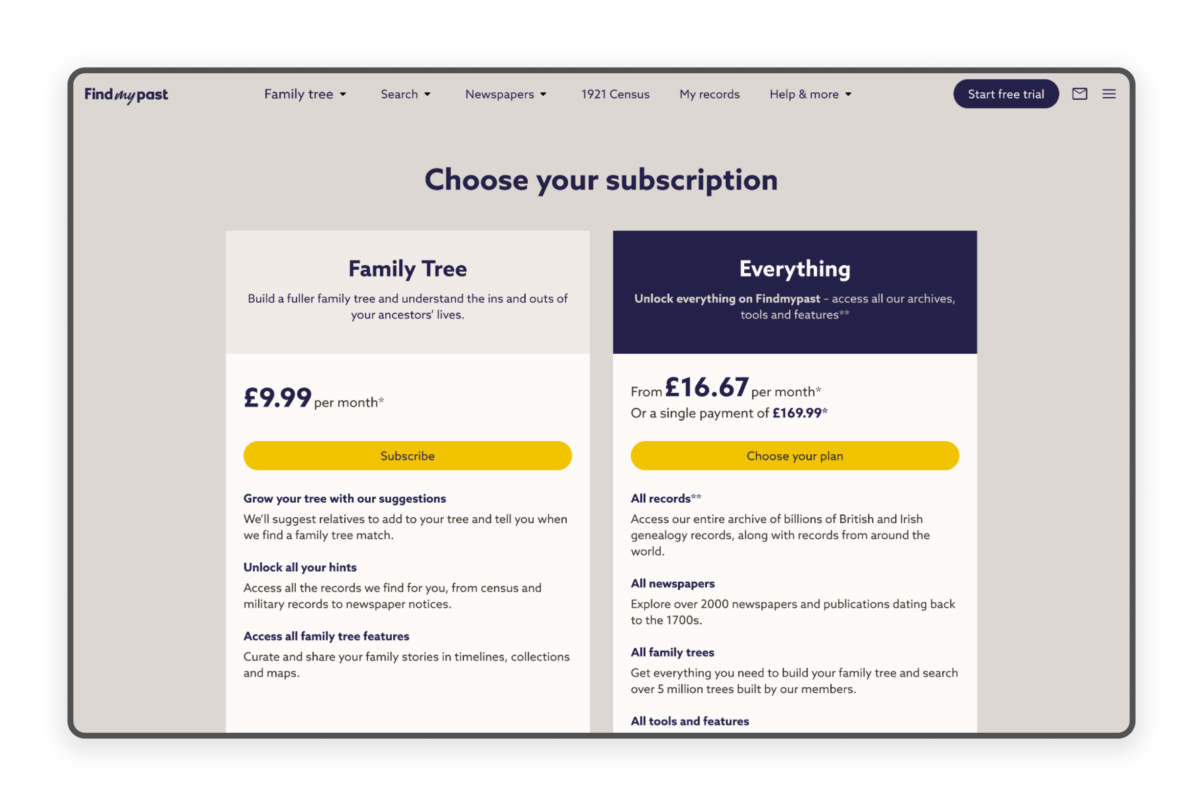
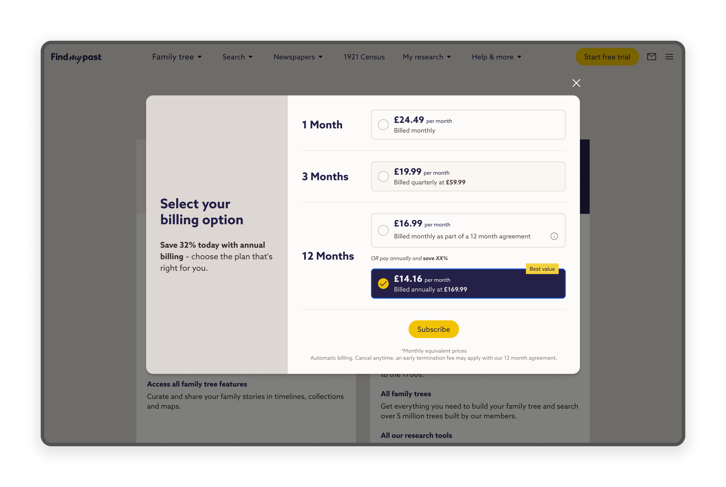
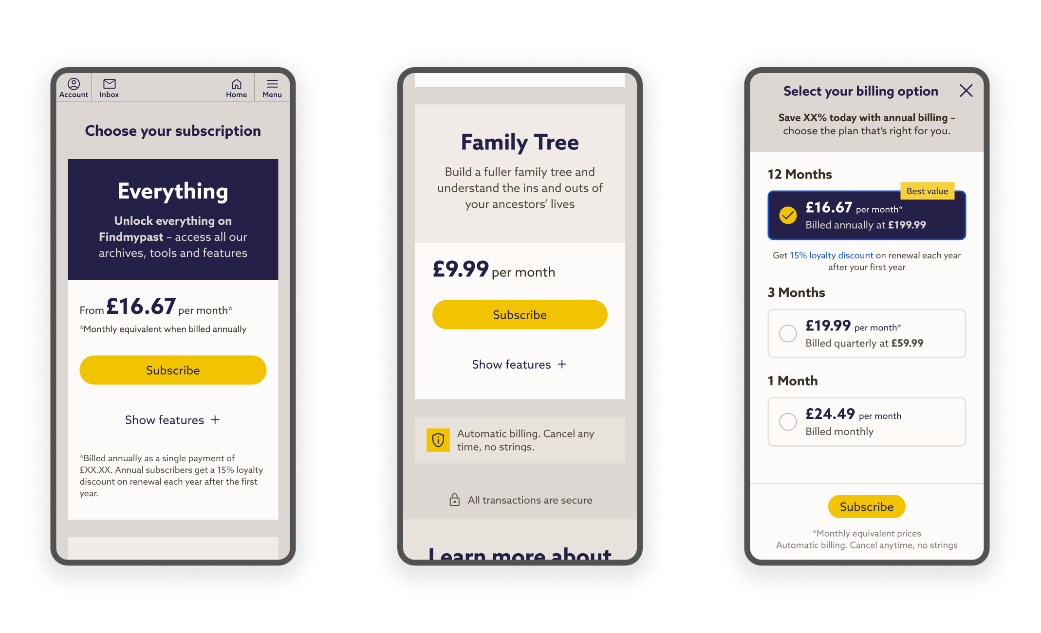
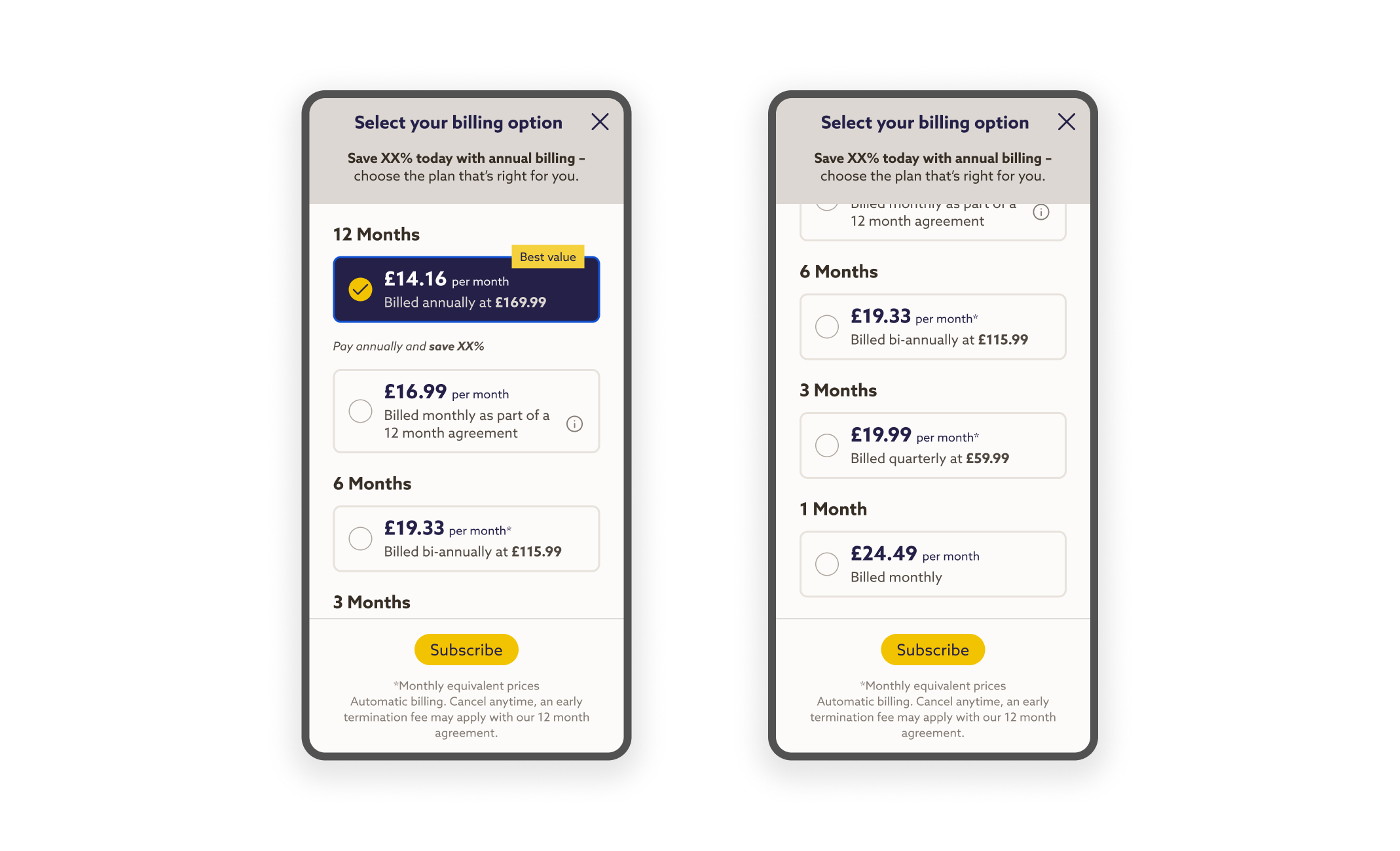
Successfully launched a key Paywall redesign based on data driven experimentation, where clarifying package duration options was the primary change. This resulted in a 3 percentage point increase in Free Trial conversions and a 6 percentage point increase for the 12 Month plan.
The initial scope of this project was to overhaul the entire subscription and checkout experience, addressing how user confusion (caused by bundled features and unclear billing terms) hindered decision making and made our new 12 Month plan inaccessible.
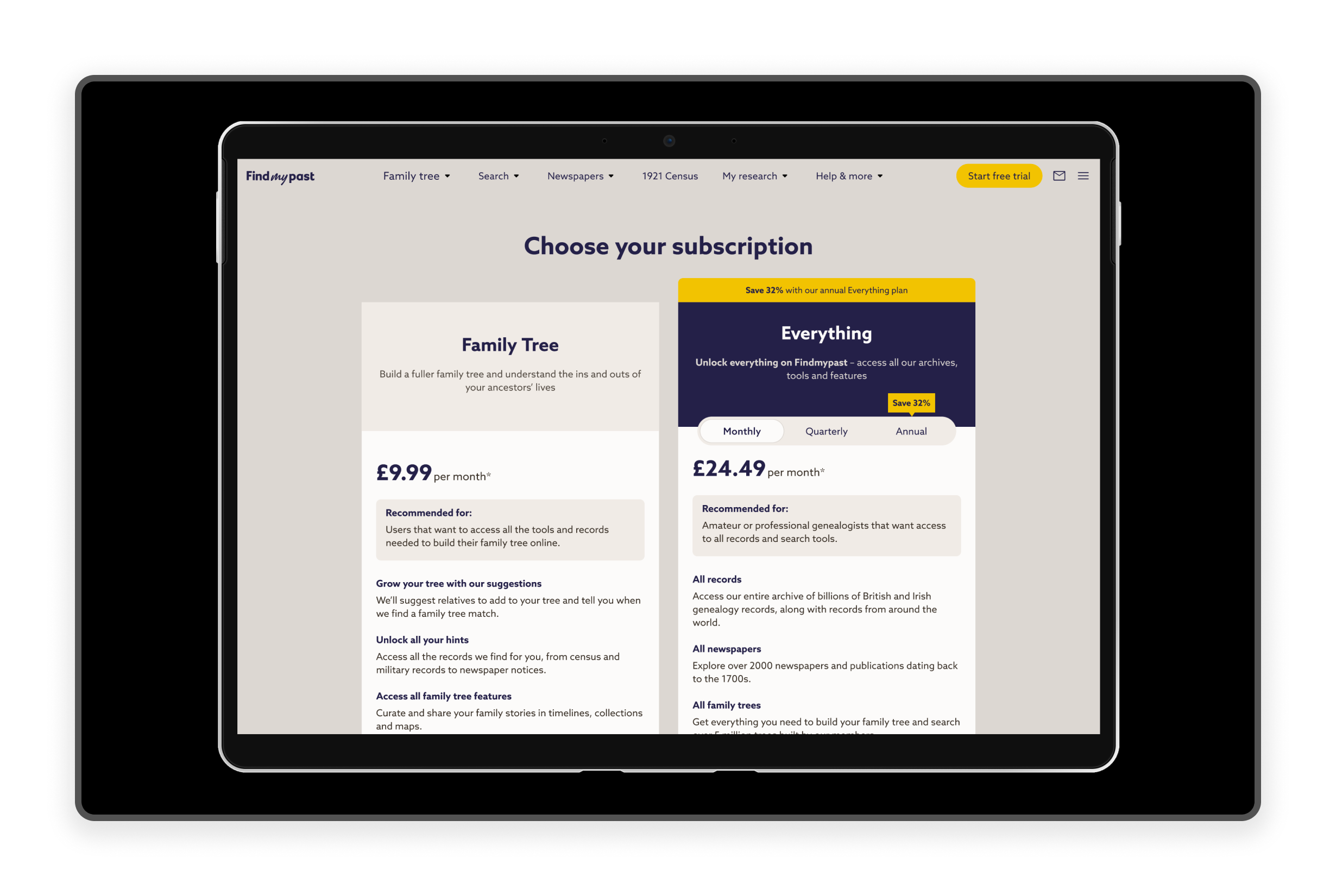
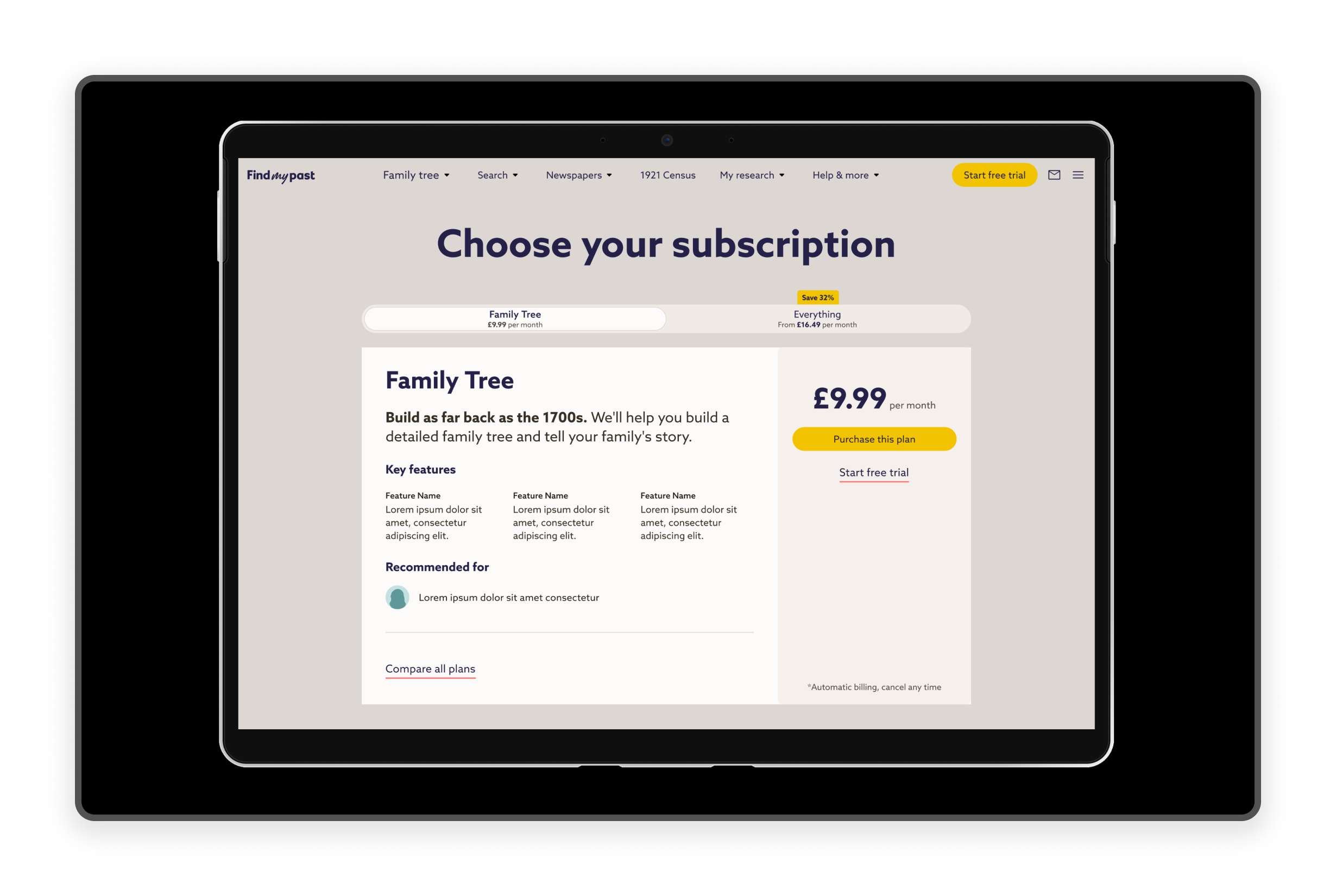
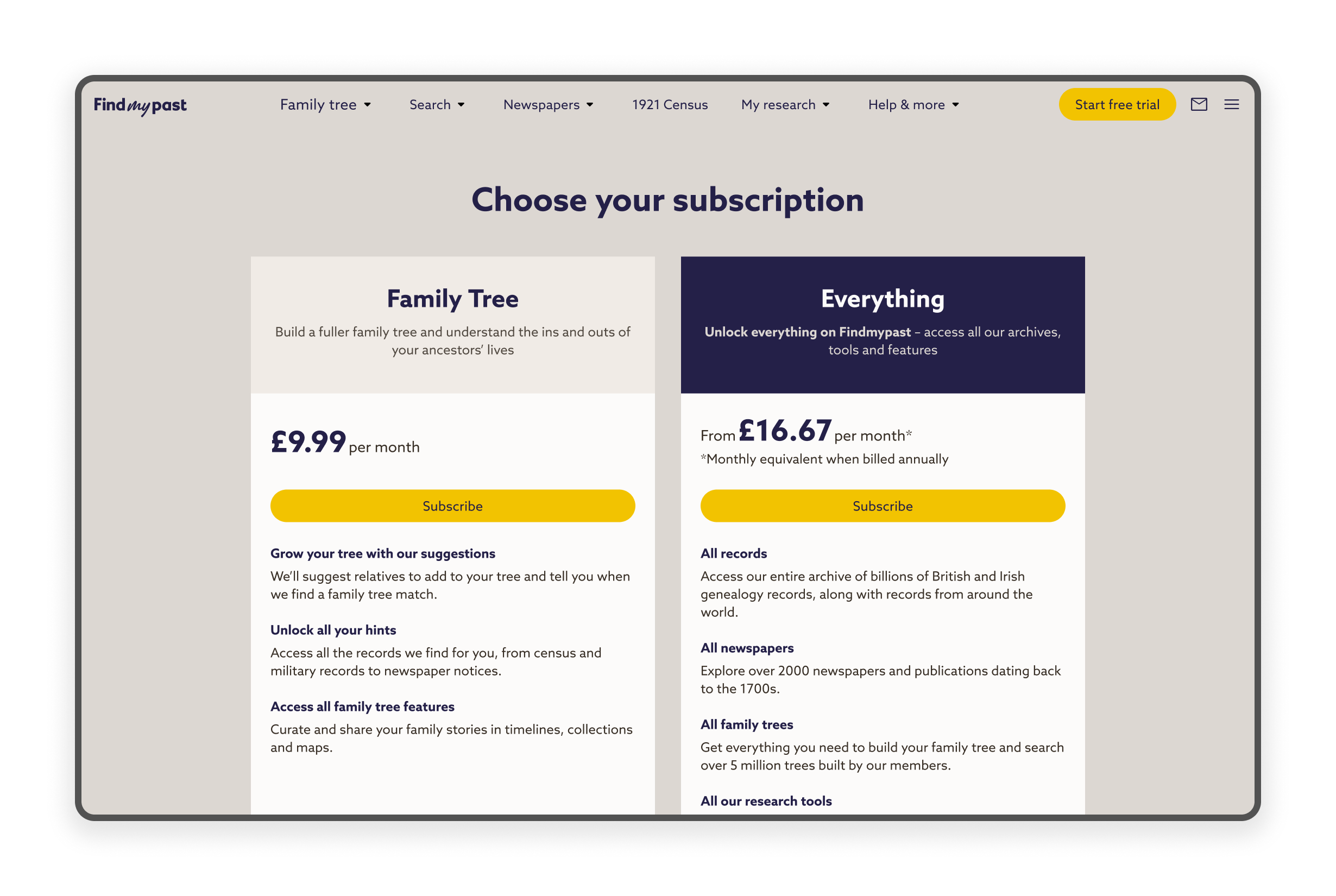
While the goal was to create clear concepts across the full flow, we ultimately focused the effort on redesigning the Paywall itself. This allowed us to quickly launch an A/B testable solution to immediately clarify the value proposition of each package through intuitive naming, transparent pricing, and flexible payment options.
To rapidly define the problem space and generate initial solutions under a tight deadline, I led a cross-functional workshop. The core team included myself, a Lead Designer, a Product Manager, and a Senior Copywriter.
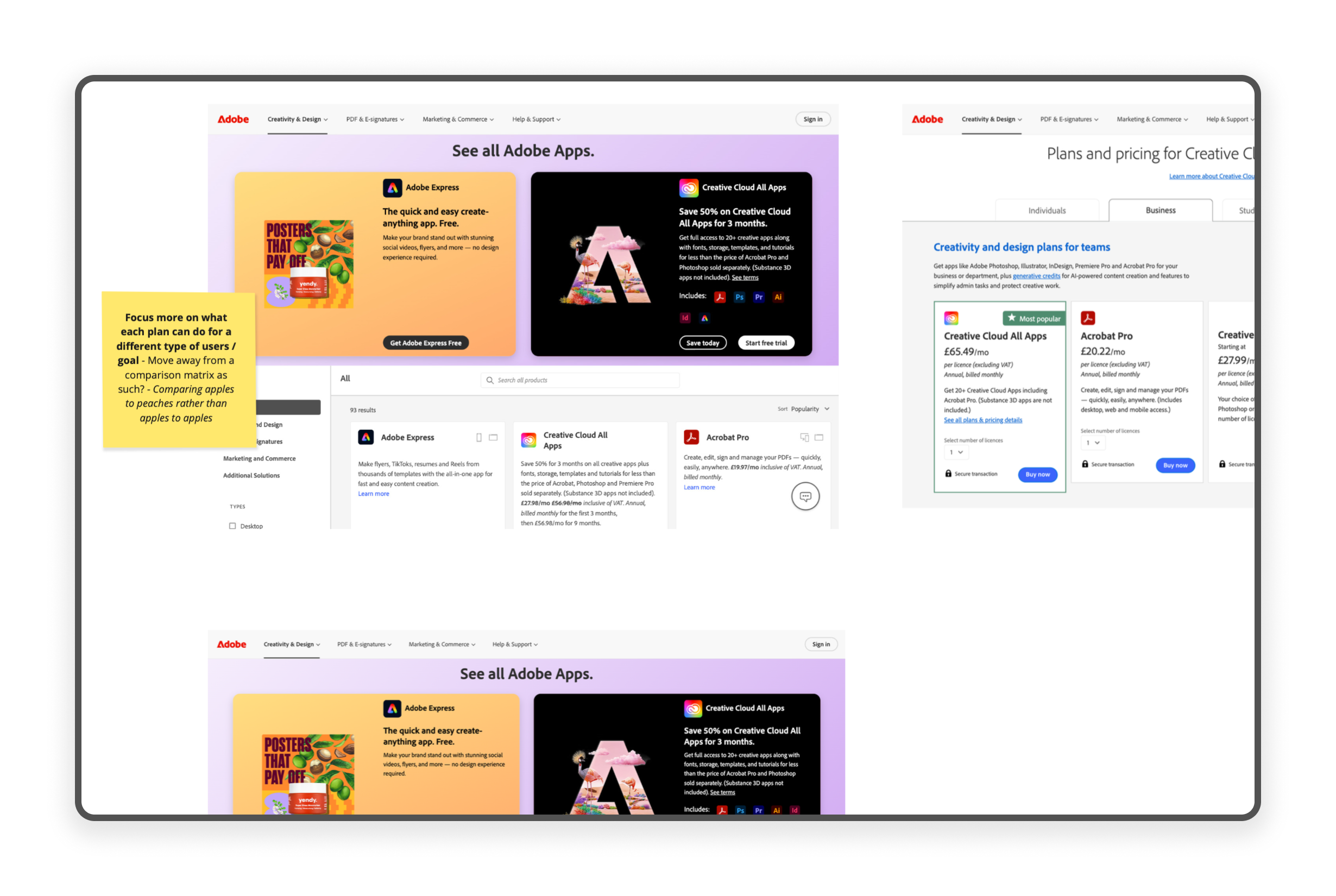
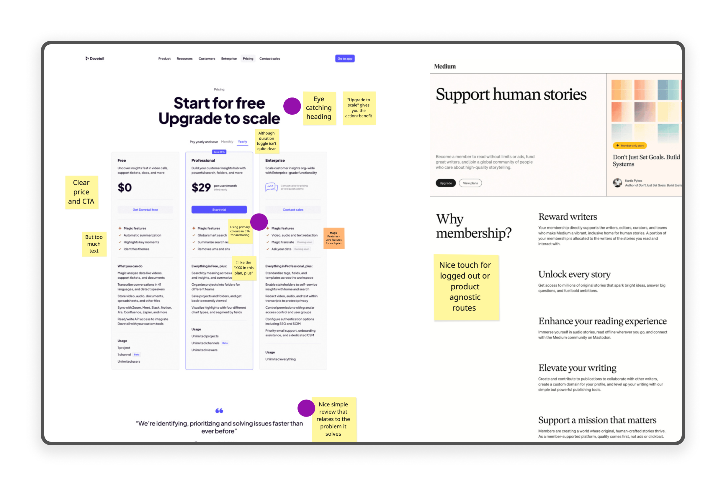
We began with a quick competitive review of the market and gathered inspiration specifically from other successful subscription models. This fast analysis informed a Crazy Eights session, allowing us to quickly sketch and refine core ideas and achieve fast consensus on the initial concept direction.
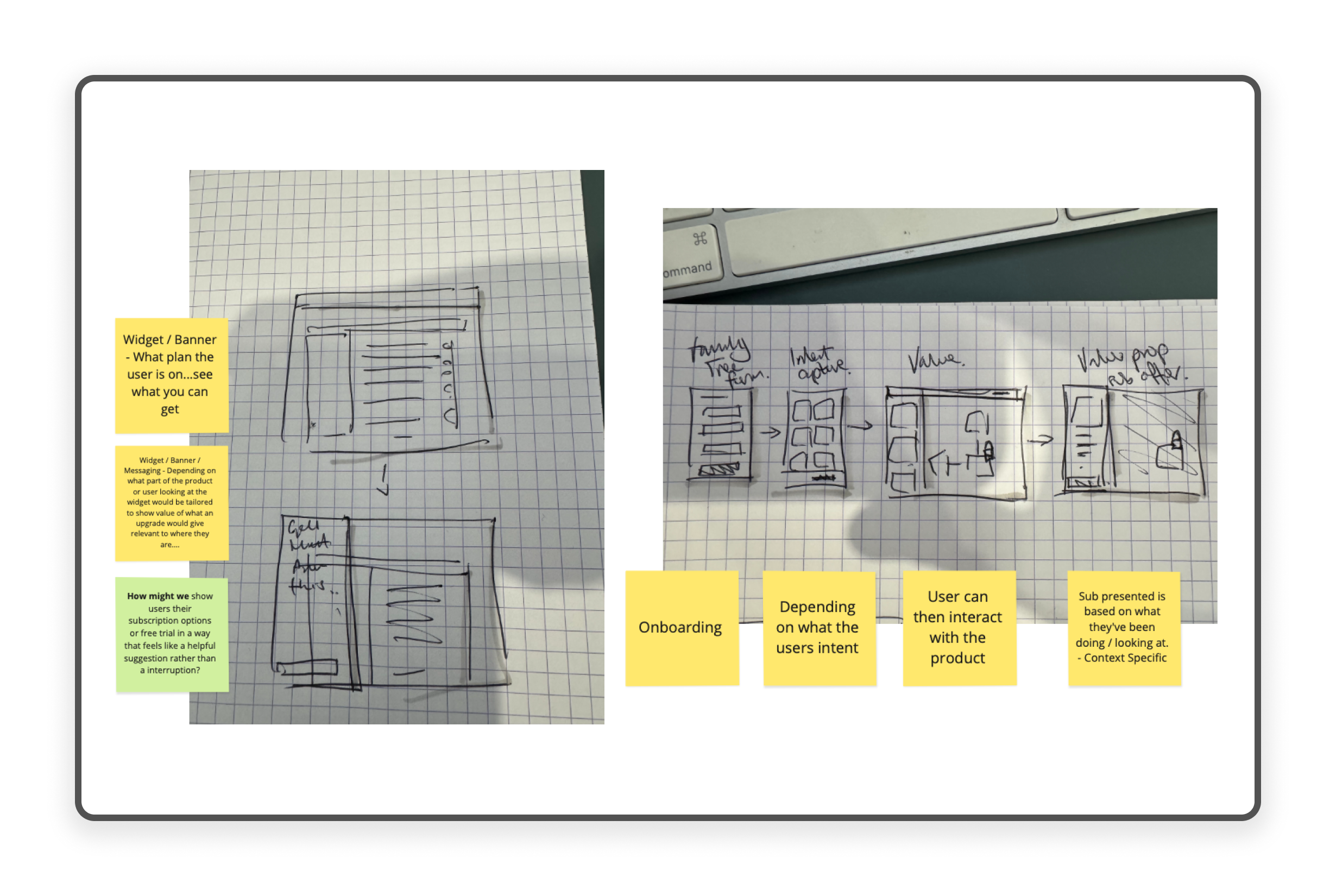
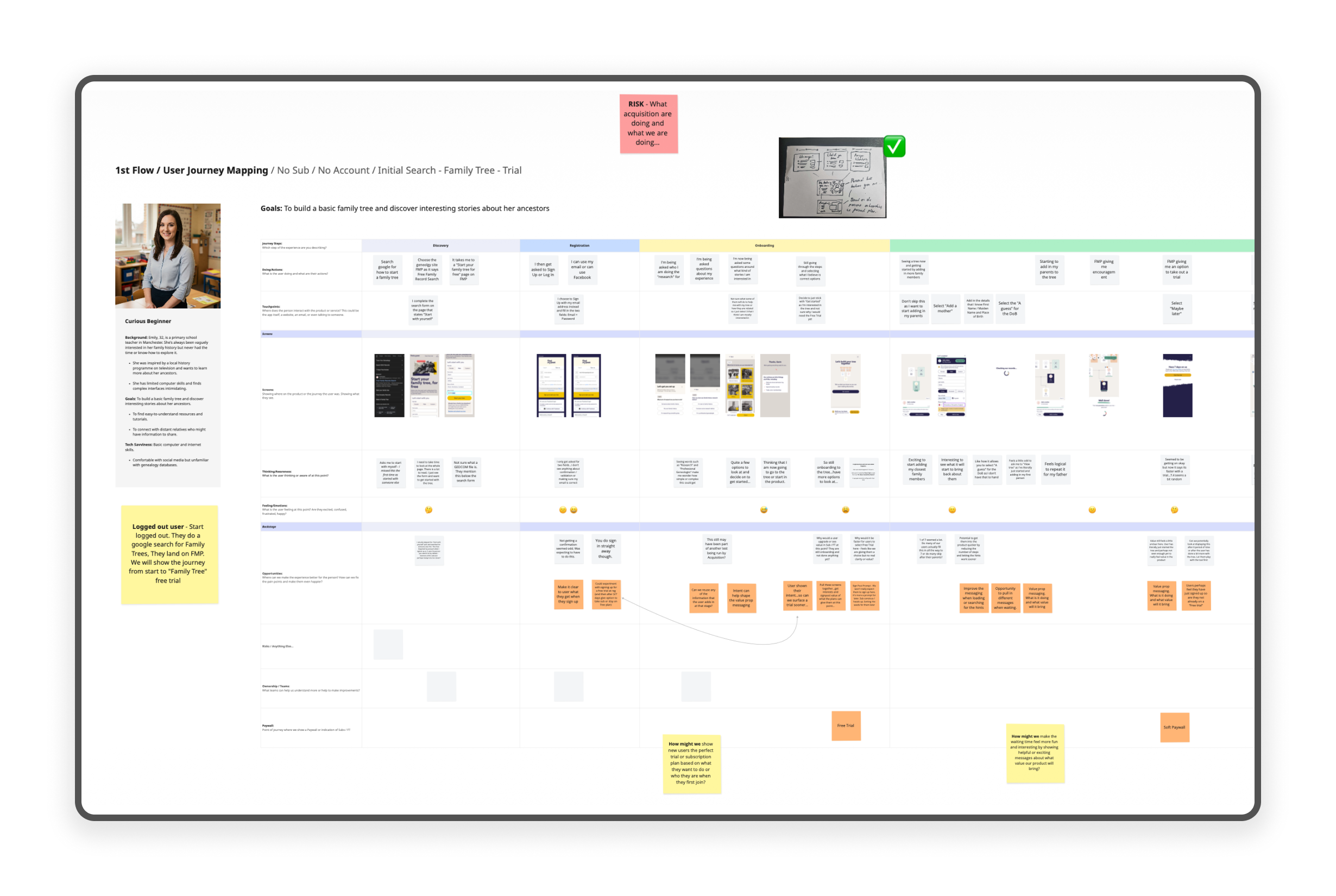
Following the workshop, I developed three distinct User Journeys to map the current subscription flow against our primary user personas. Leveraging my experience, I was able to proactively identify critical potential pain points within the flow. These pain points were then translated into a prioritised list of strategic opportunities for product improvement and optimisation.
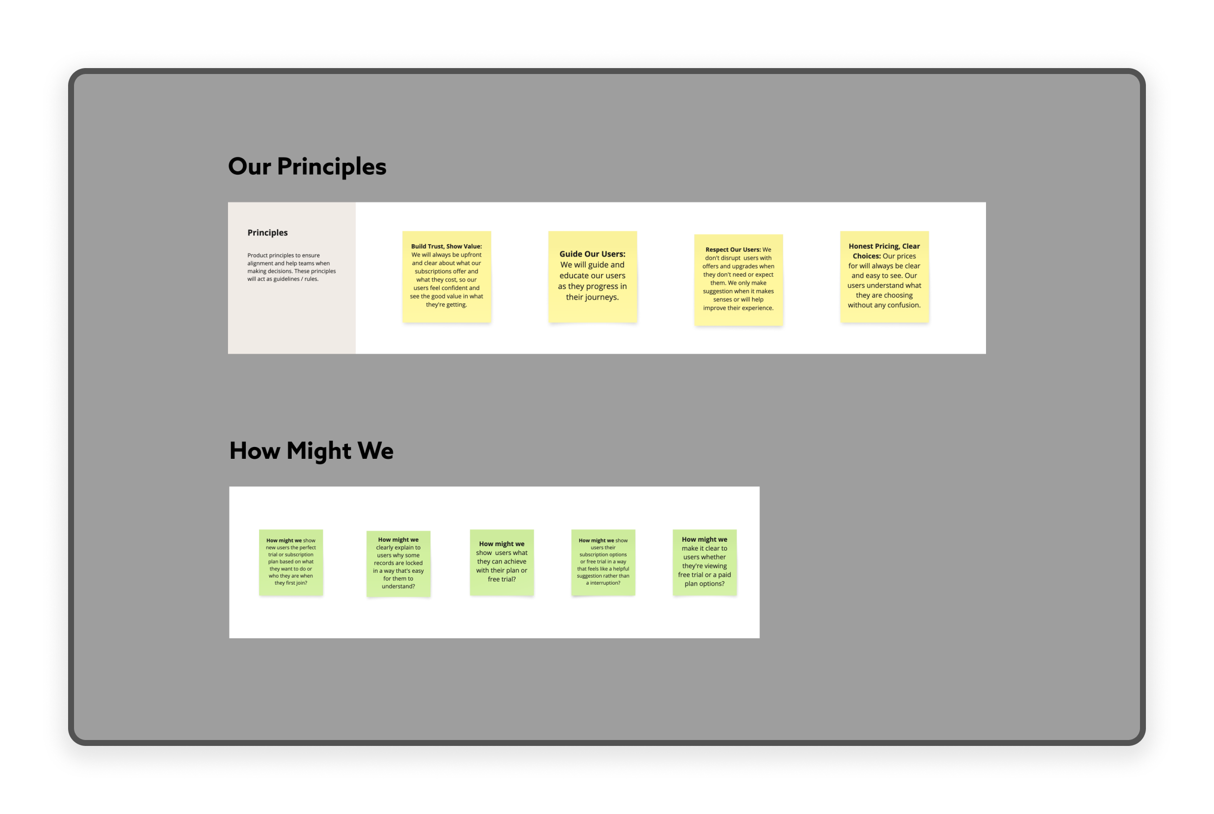
To ensure project continuity and alignment, I created clear Product Principles. These principles now serve as foundational guidelines for all future design and development efforts.
Finally, to transition from strategy to actionable design, I developed a series of "How Might We" statements. These HMWs were generated directly from user pain points and the new principles, acting as concise challenges to focus the team's creative energy for subsequent ideation.
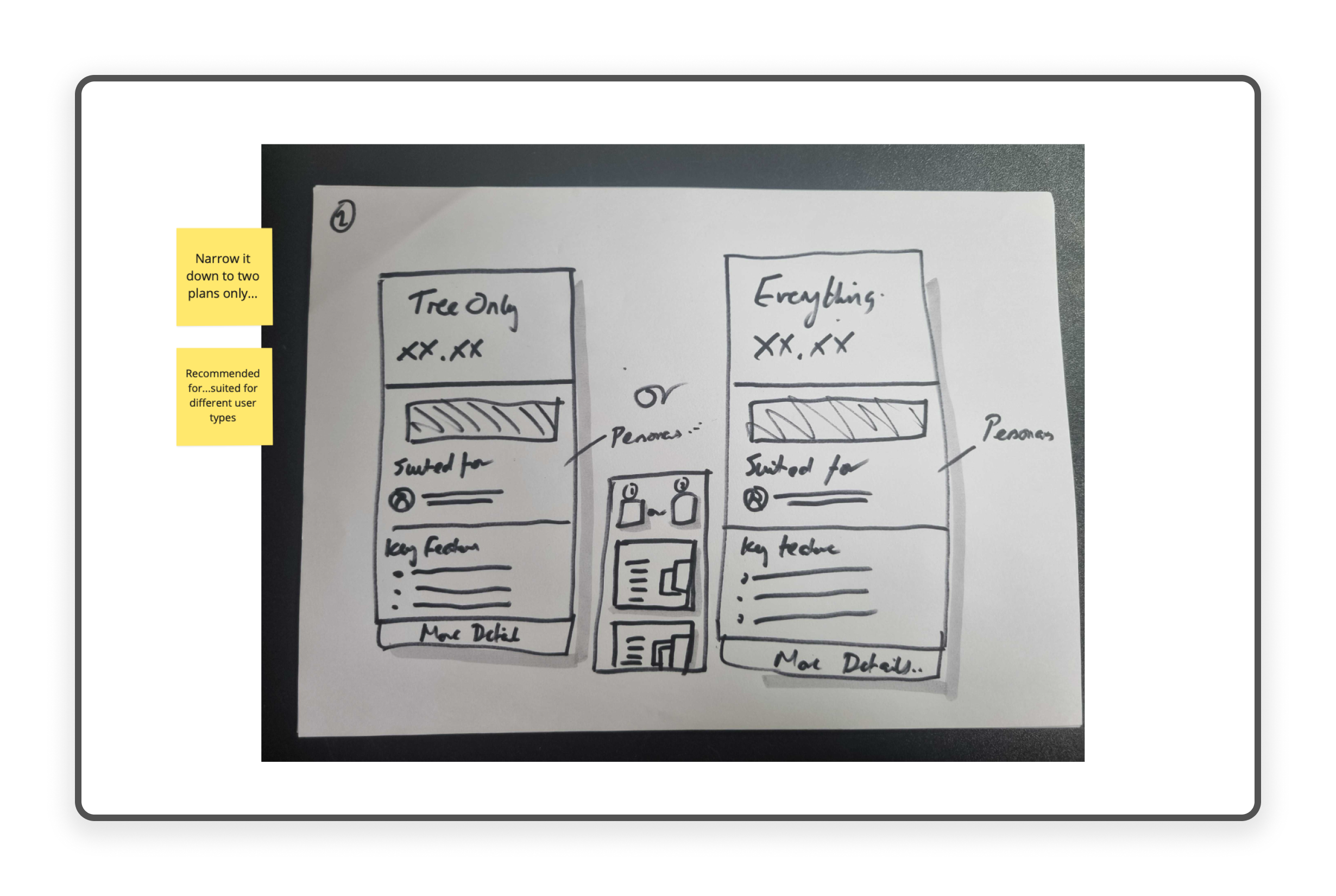
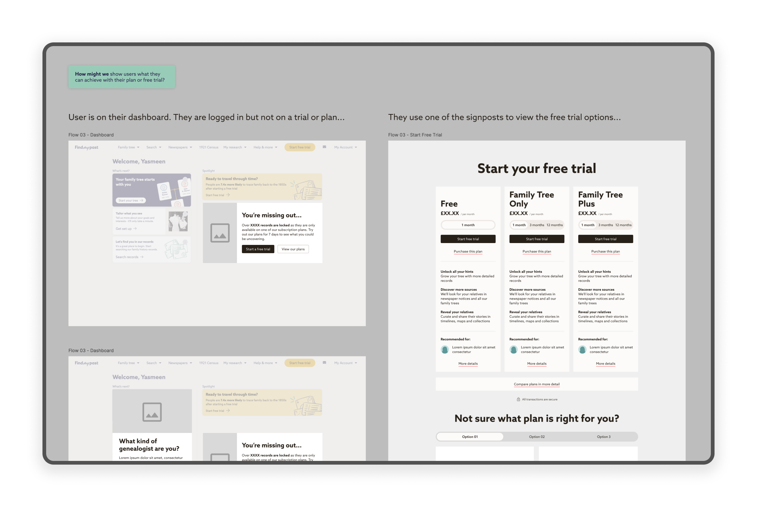
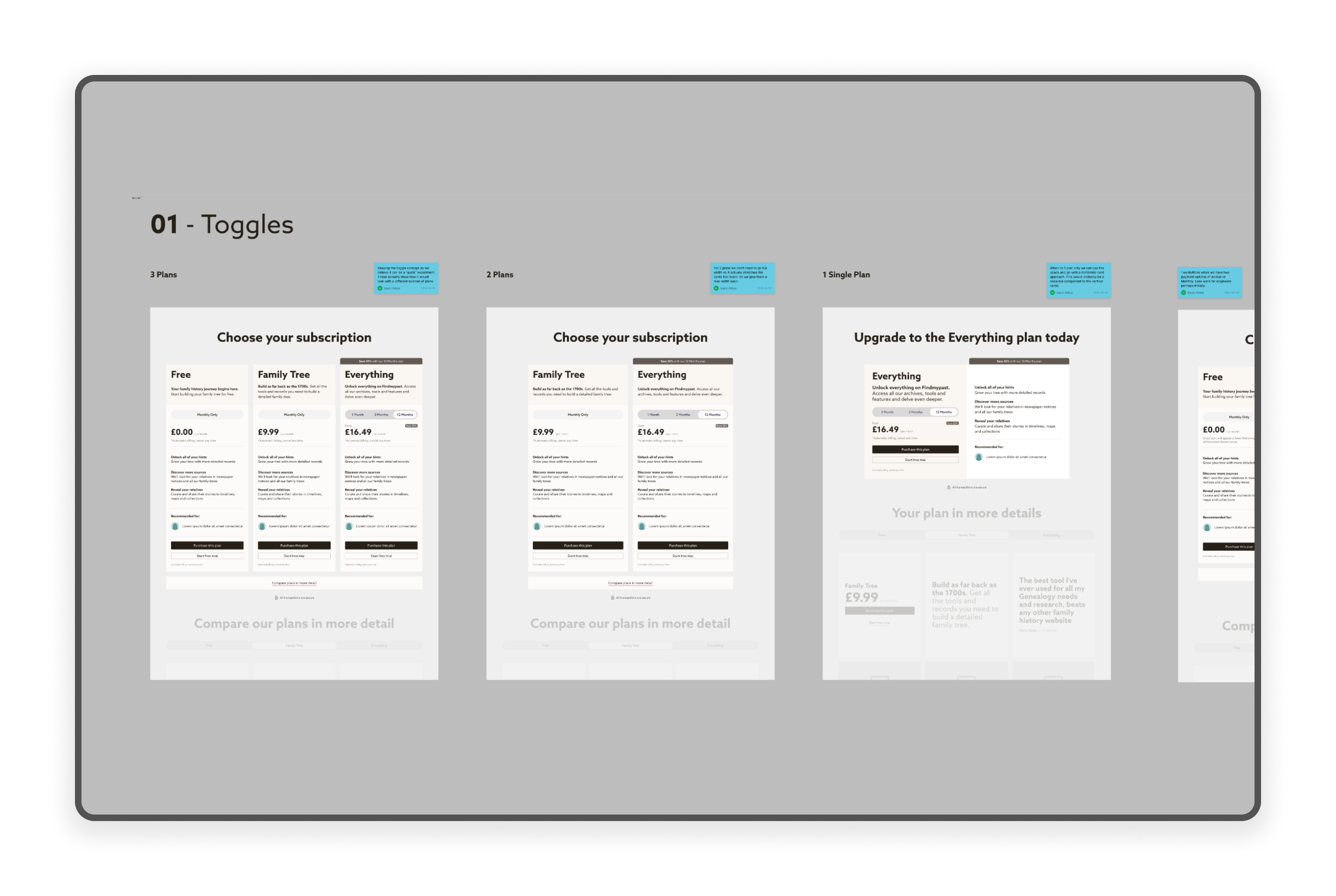
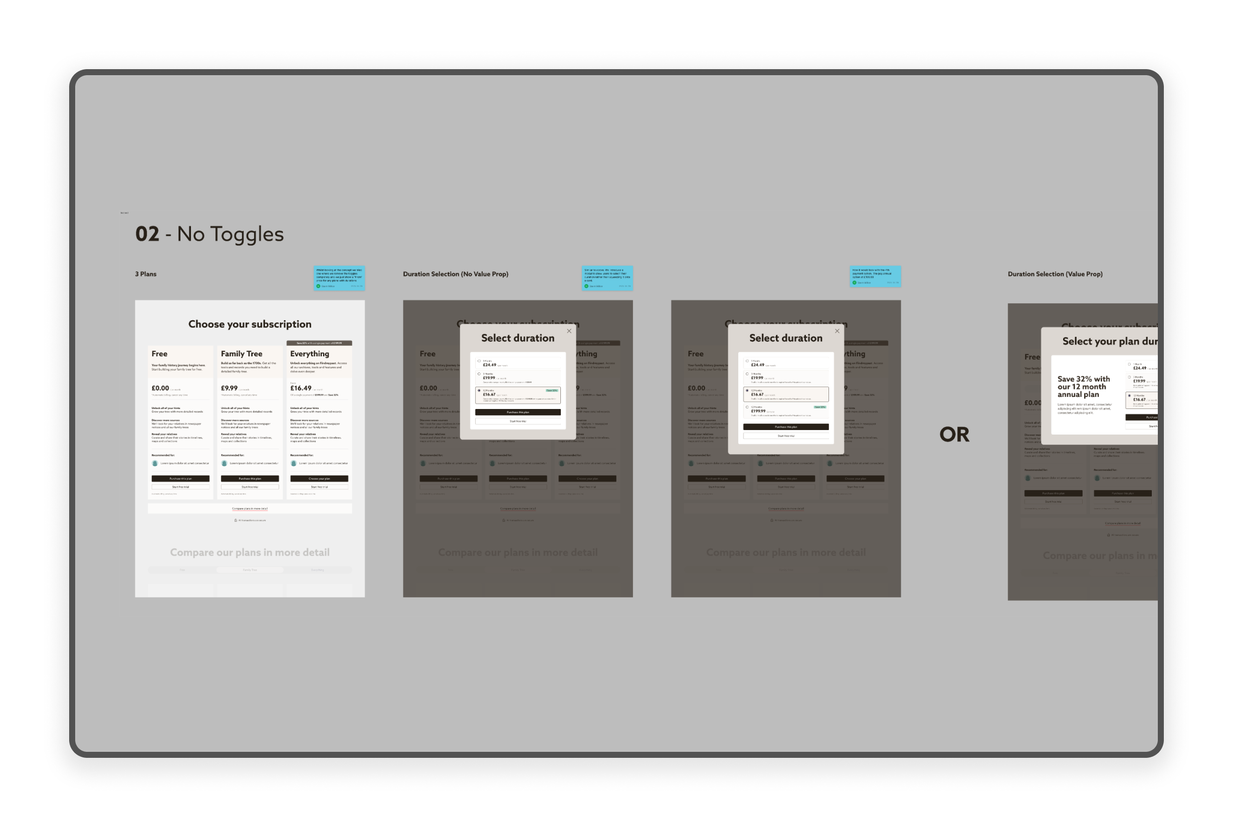
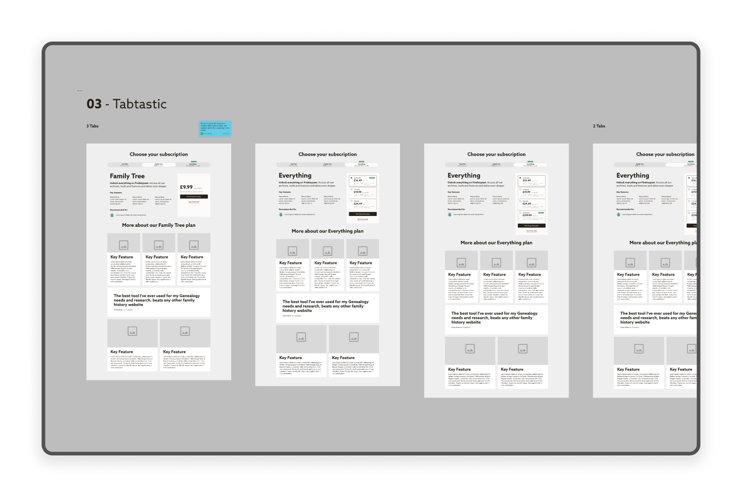
Leveraging the prioritised HMW challenges and the established Product Principles, I quickly transitioned to low fidelity wireframing. This phase focused on translating the new user journeys into functional, structural layouts.
To ensure the work remained robust and aligned, I regularly shared progress at Design Critiques and presented early concepts to the engineering team for immediate feedback and technical alignment.
This rapid, collaborative iteration process allowed us to test core flows, secure early stakeholder validation, and prepare the foundational design for high-fidelity visual work.
To ensure continuous alignment, I ran formal presentations and check ins with stakeholders and leadership. I facilitated targeted feedback sessions after major design milestones, then integrated the team's input to guarantee that all revisions addressed business needs while upholding our core Product Principles and HMW challenges.
I prepared detailed Technical Handoff documentation, including finalised specifications for the new subscription flow. Crucially, I arranged a proactive walkthrough call with the engineer to review all acceptance criteria and components. This meticulous handoff ensured smooth and accurate implementation, allowing the new flow to launch directly into the A/B testing environment.
The initial A/B test delivered highly promising early results, performing well enough to immediately warrant a quick iteration. While the full, long term impact was not yet realised, the data clearly indicated a significant uptick in key conversion metrics compared to the original legacy experience.
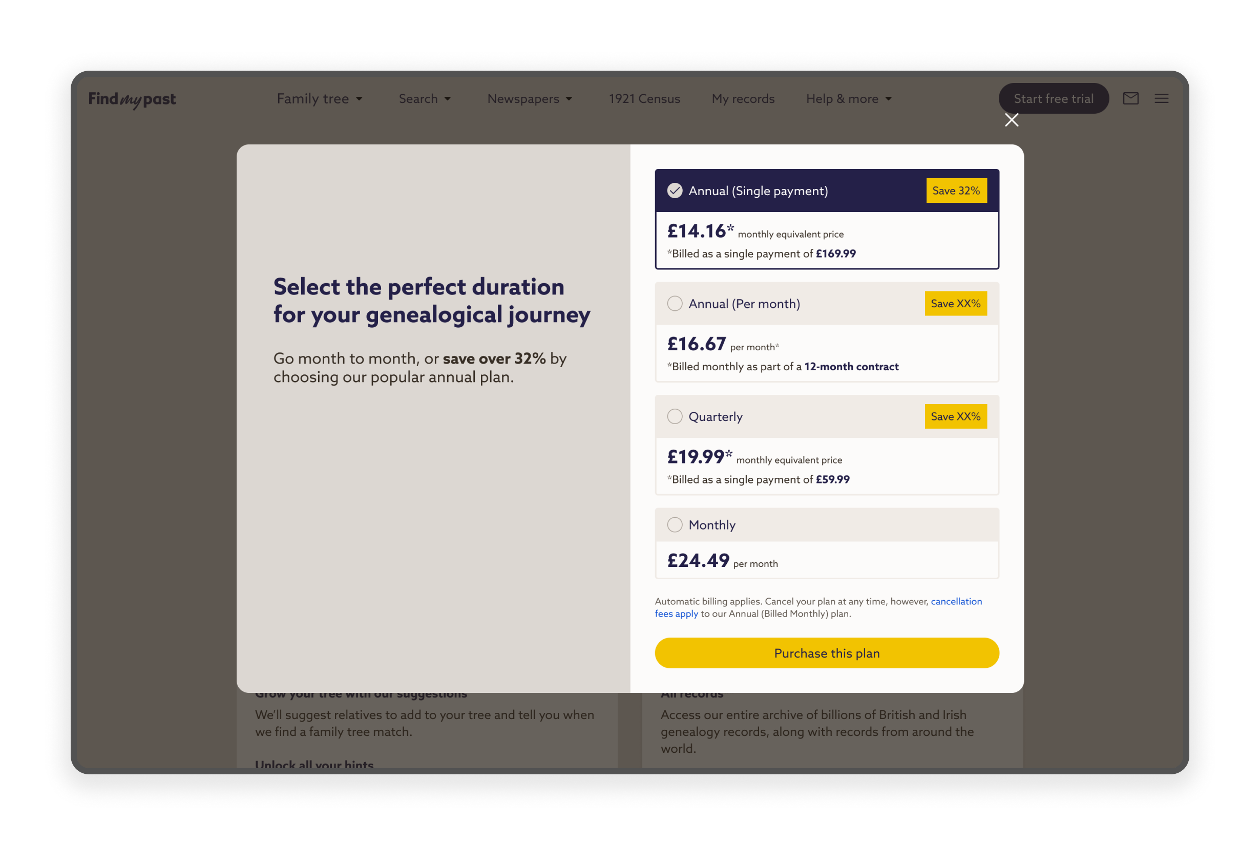
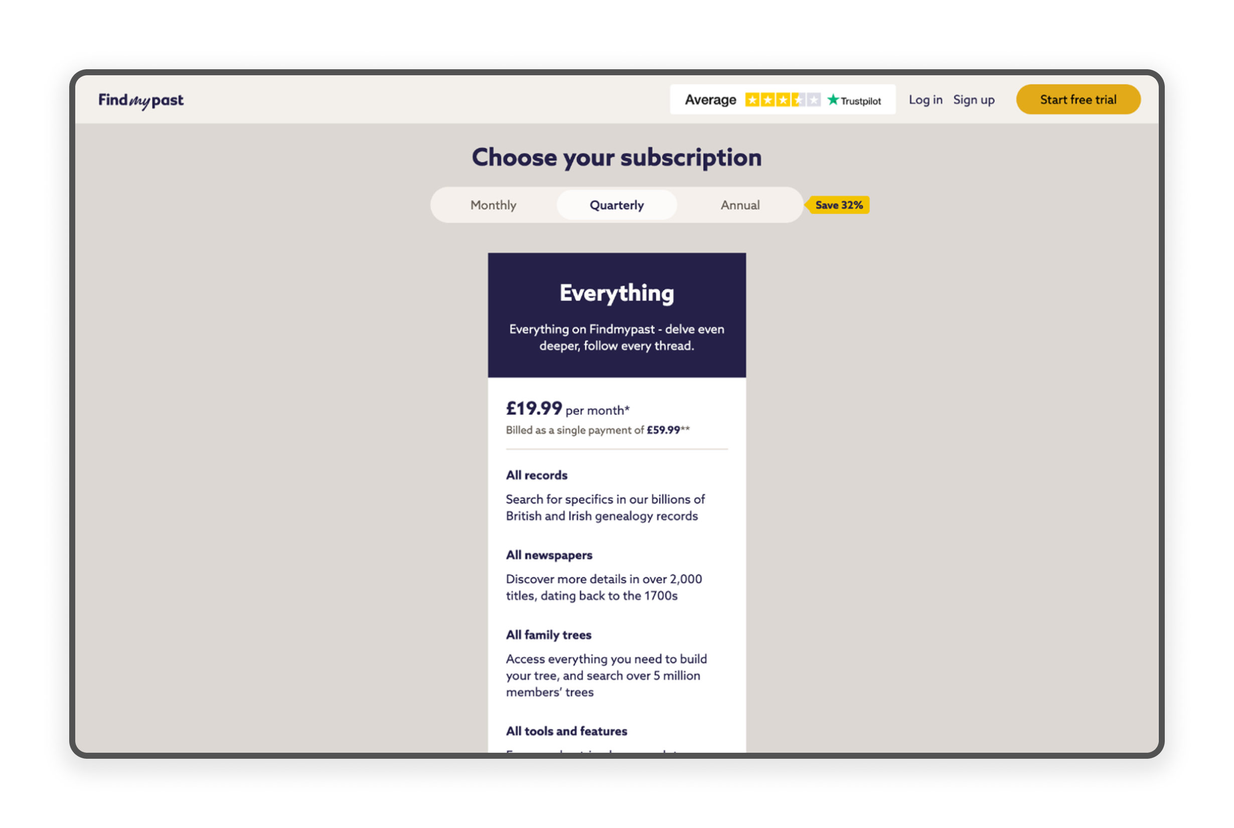
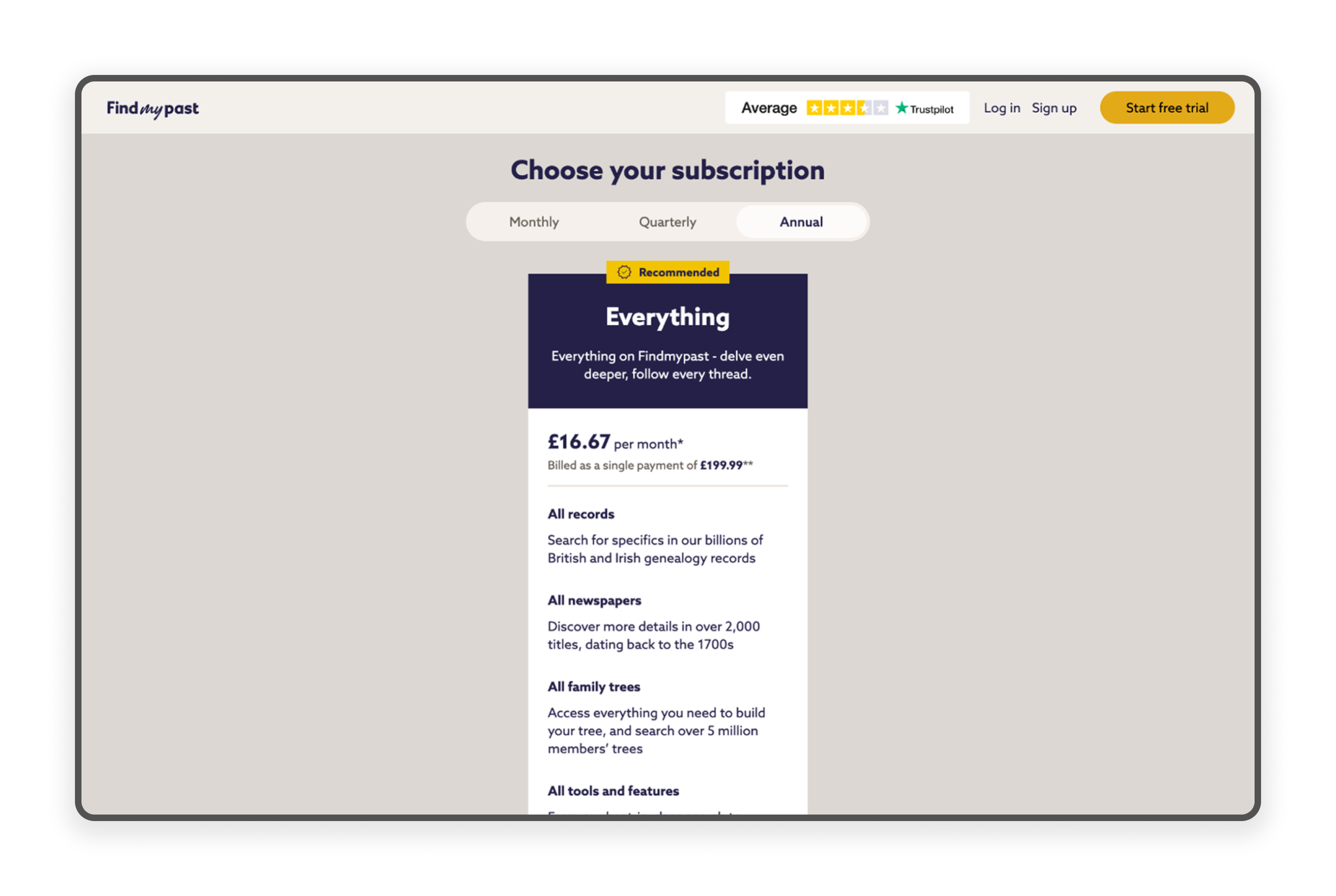
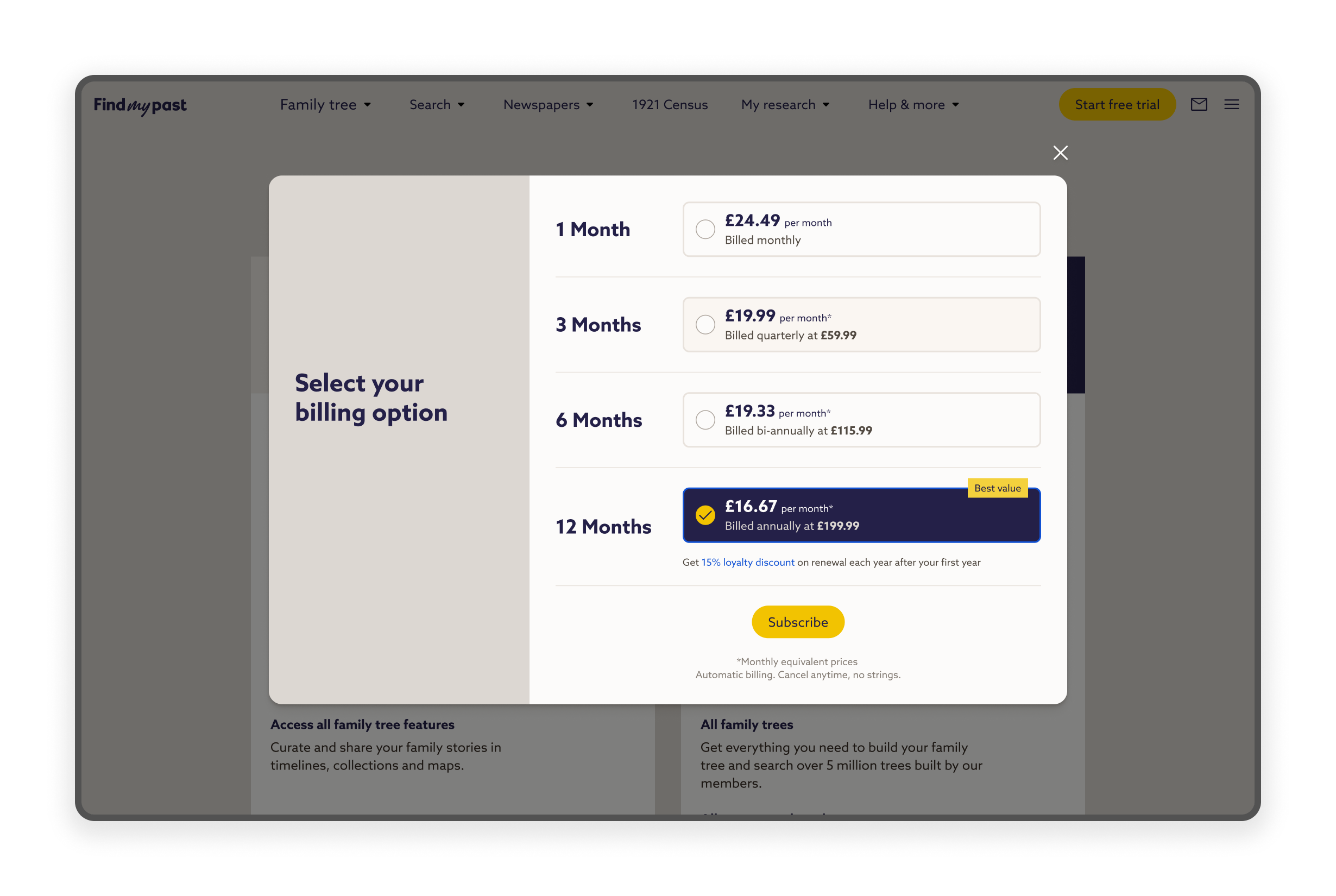
Following this early success, we decided to make a few minor, high impact UI amendments to enhance clarity and reduce user friction. I made specific changes to the paywall, most notably consolidating two separate 'Annual' options into a single, clearly differentiated header. This adjustment aimed to improve user focus on duration, allowing us to immediately relaunch the improved flow into a new test phase for validation.
The Paywall optimisation delivered strong early results, driving a significantly healthier package mix without compromising overall user volume.
Acquisition Volume: Maintained stable trial start volume, ensuring a consistent flow into the subscription funnel.
Free Trial Conversions (Efficiency): Achieved a +3 pp uplift in conversion efficiency (Trial-to-Paid).
Strategic Win (12 Month Share): The 12 Month plan share grew by +6 pp, now representing close to half of all new subscriptions.
Stabilise & Validate: We will monitor Paywall performance to confirm the initial conversion uplift and plan mix remain stable.
Anchoring Test Launch: Launch a high impact Anchoring Price Test in November focused on maximising 12 Month plan uptake.
Scale & Plan: Implement the winning test variant across the audience, then use the learning to define the Q1 experimentation roadmap.
The above is a high level summary of the project. If you would like to know more of the details then please feel free to get in touch with me.