An experiment to learn what matters the most to travellers so that we could surface a recommendation or preferred booking option
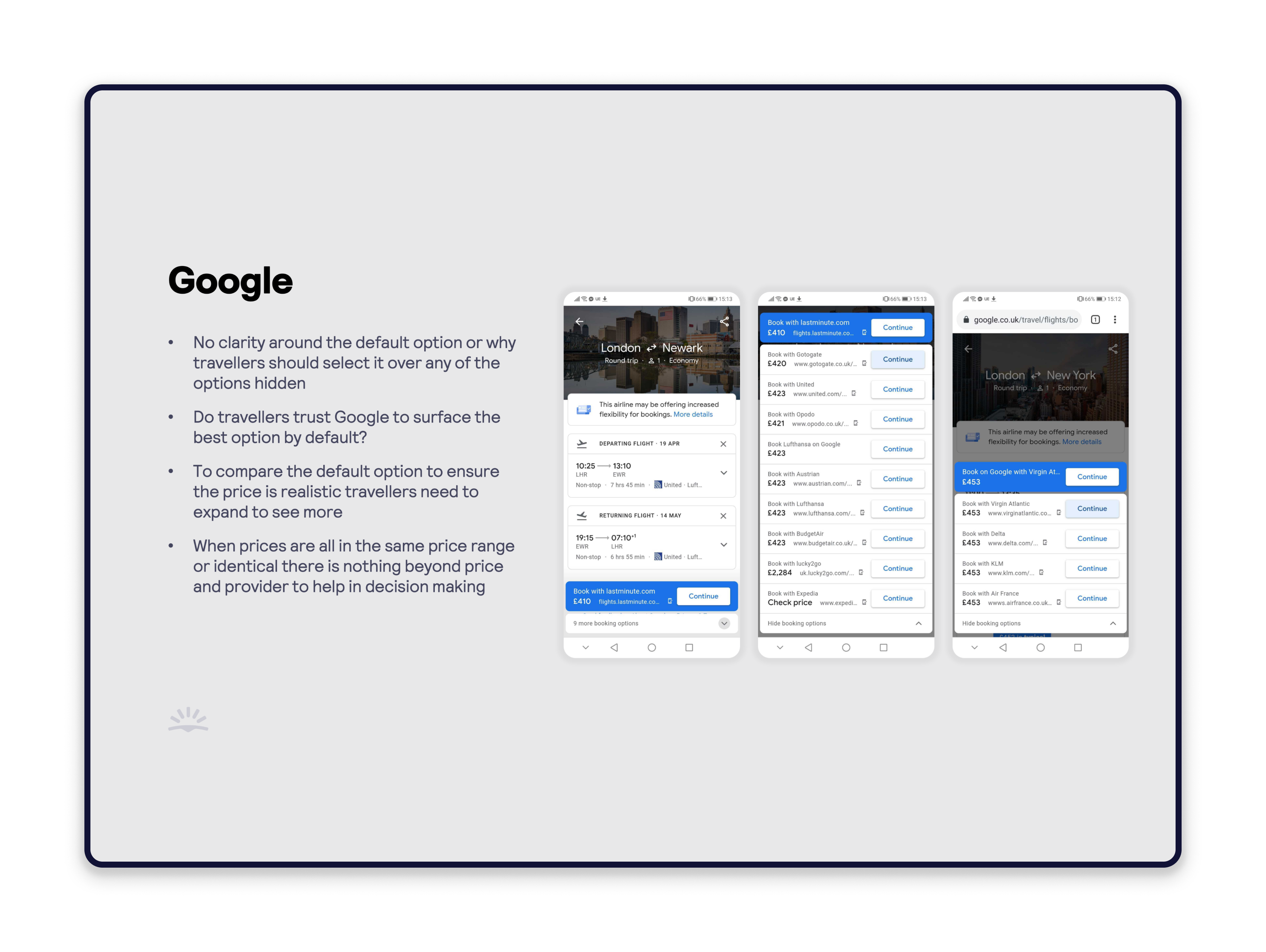
Our travellers were often overwhelmed by the sheer choice (ranging from 2 to over 20 options). They frequently chose the airline, even when it was more expensive, due to a lack of provider recognition and limited comparison data beyond price and our rating.
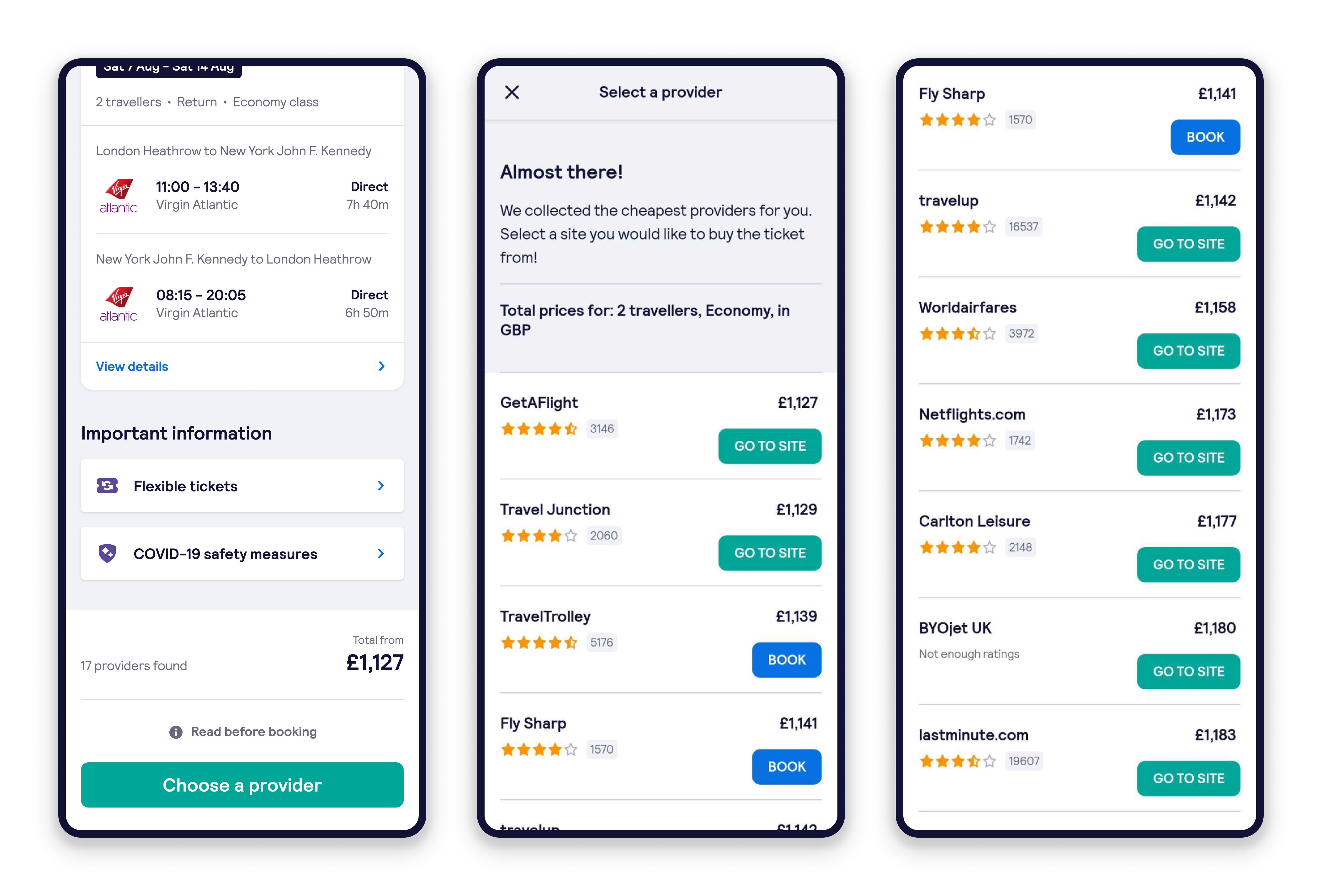
Travellers knew that every provider, including the airline, was selling the same flight on the same plane, creating an opportunity to differentiate providers. We researched the non-price factors (like customer service, booking ease, and flexibility) that mattered most to travellers, allowing us to highlight those offering a better overall booking option.
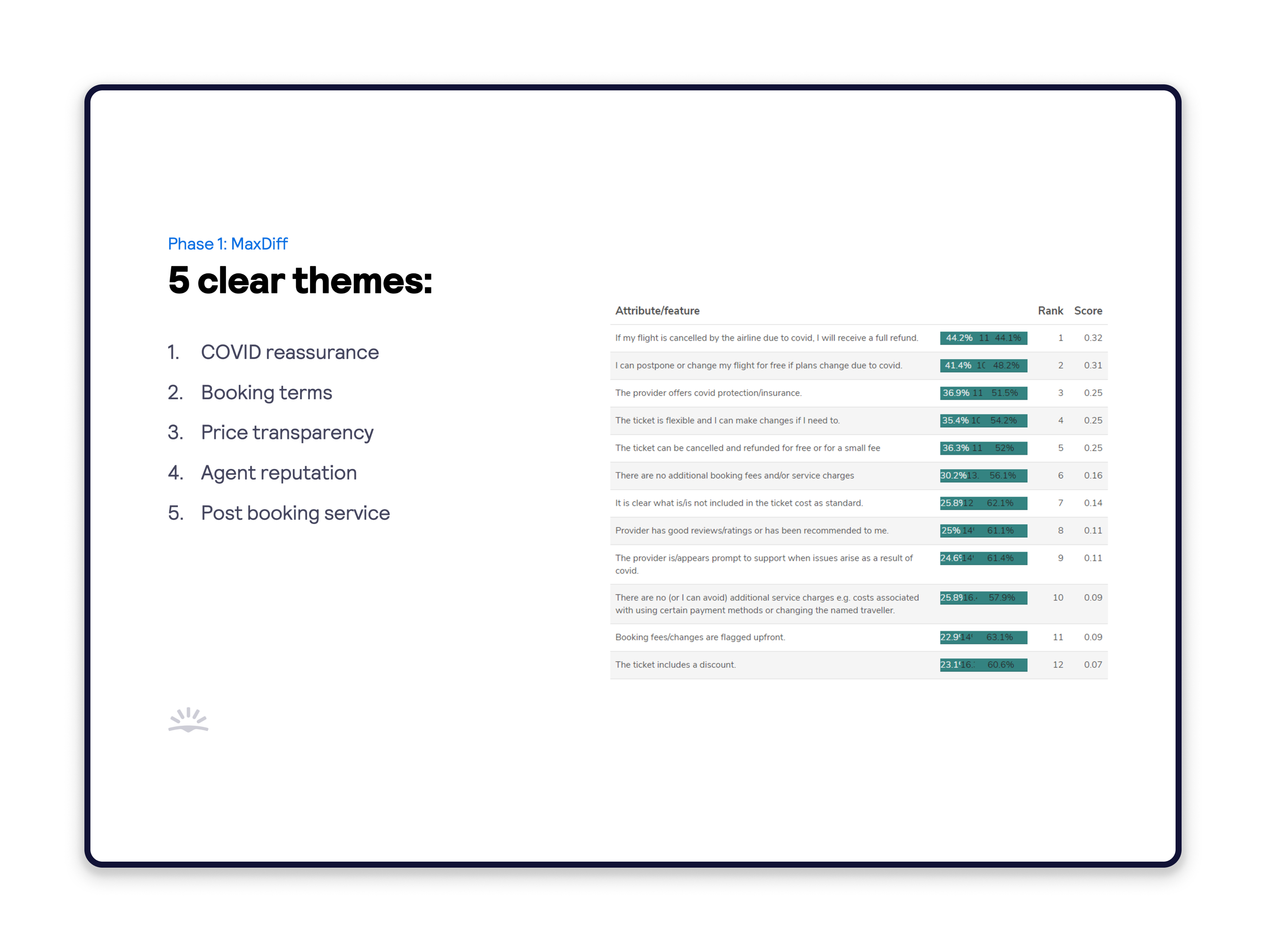
Our research team started to identify what mattered the most to our travellers when they were deciding on who to book with. The team discovered over 30 factors that influenced travellers' choices. We wanted to narrow this list down to what mattered the most when it came to booking.
We narrowed it down to 5 clear themes using MaxDiff analysis:
1. Price
2. Customer service
3. Ticket flexibility
4. Covid protection
5. Convenience of booking
For this experiment, we made the decision early on to just cover the UK market. Different markets could return a different set of factors that influenced the travellers' choice.
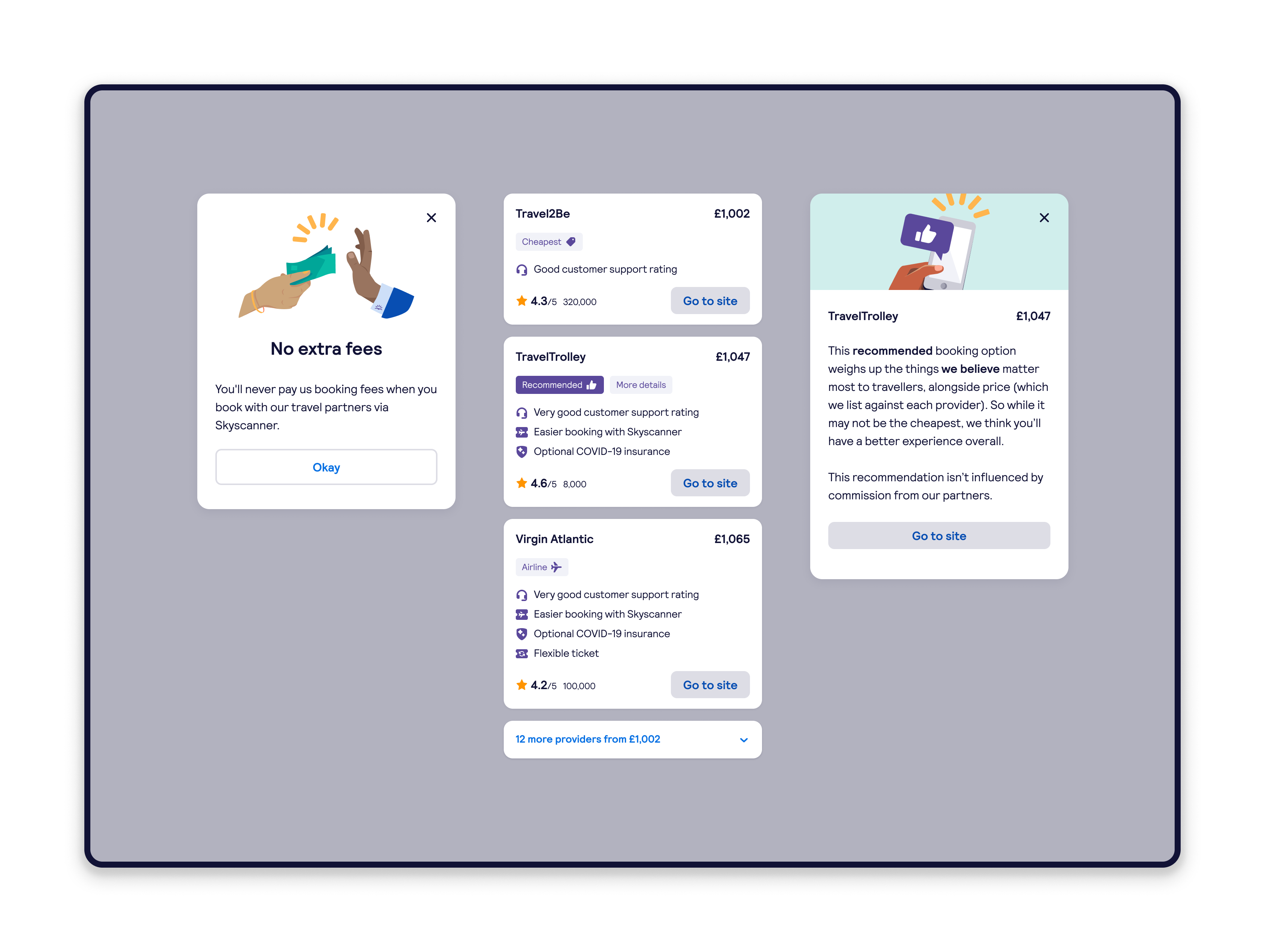
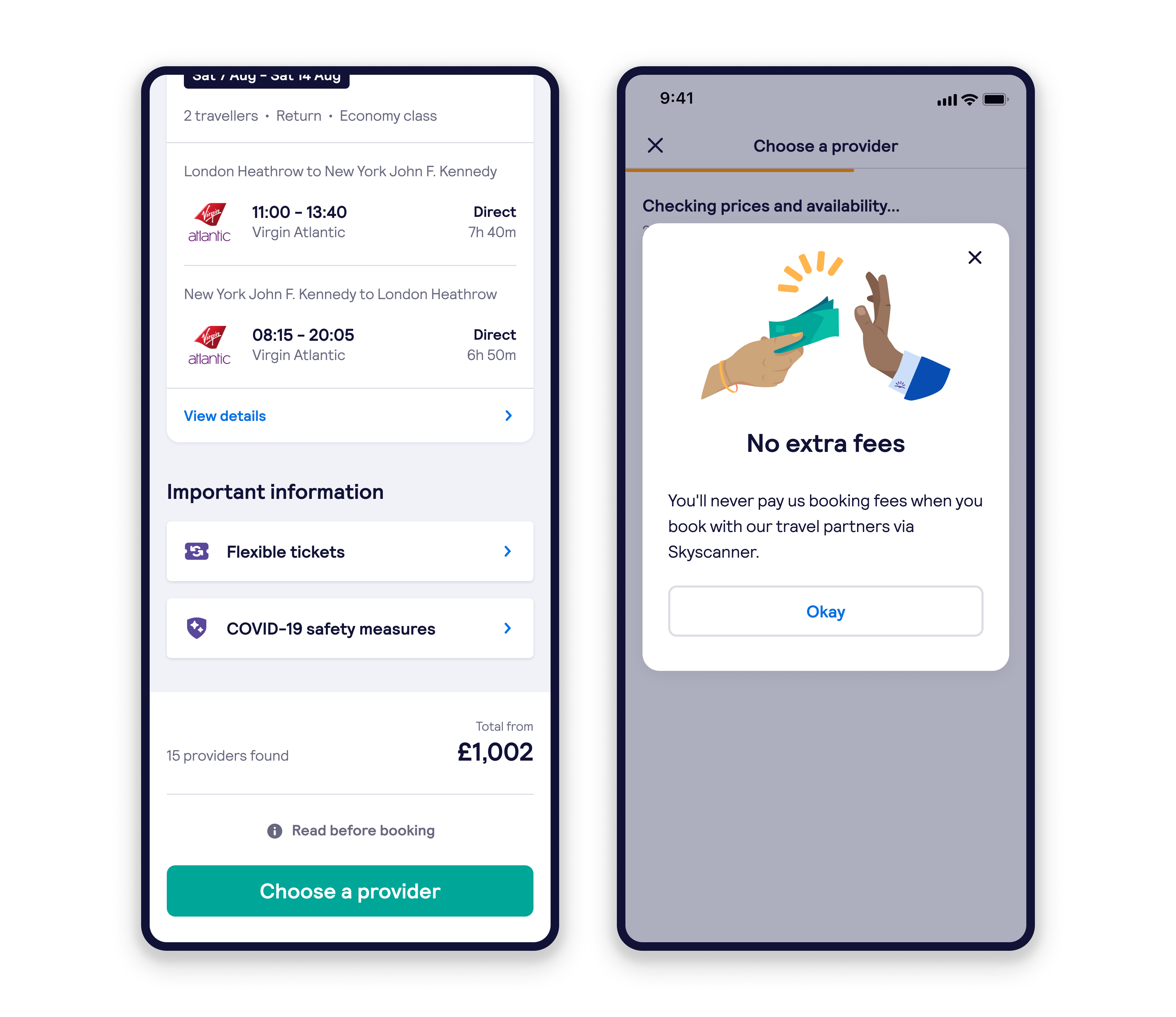
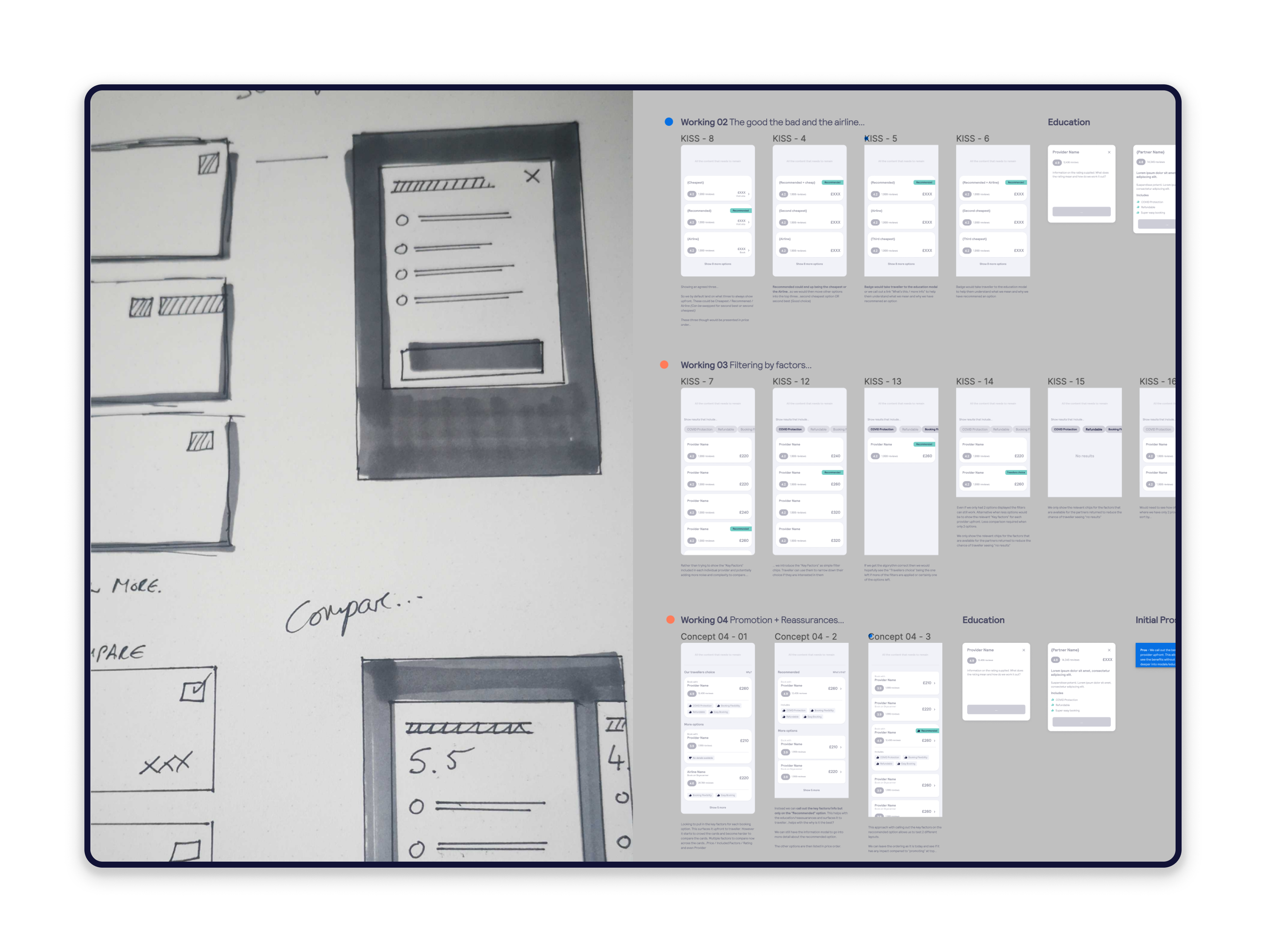
Recommendation - When it came to showing a preferred booking option to our travellers, we really needed to consider how we promoted it, helped them understand why we were recommending it, but also allowed them to still compare other options.
Education - We needed to help educate our travellers so they trusted our option and could see how it offered them value and still be transparent around the price.
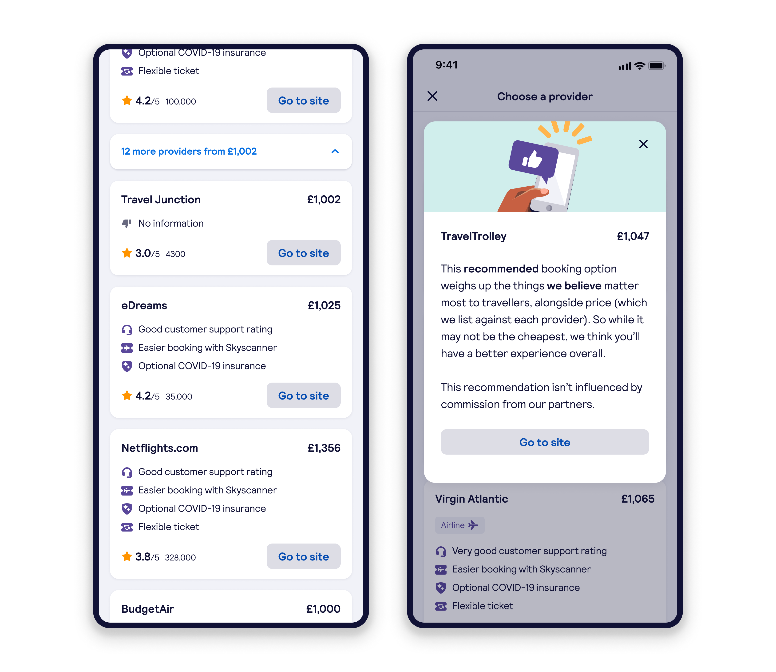
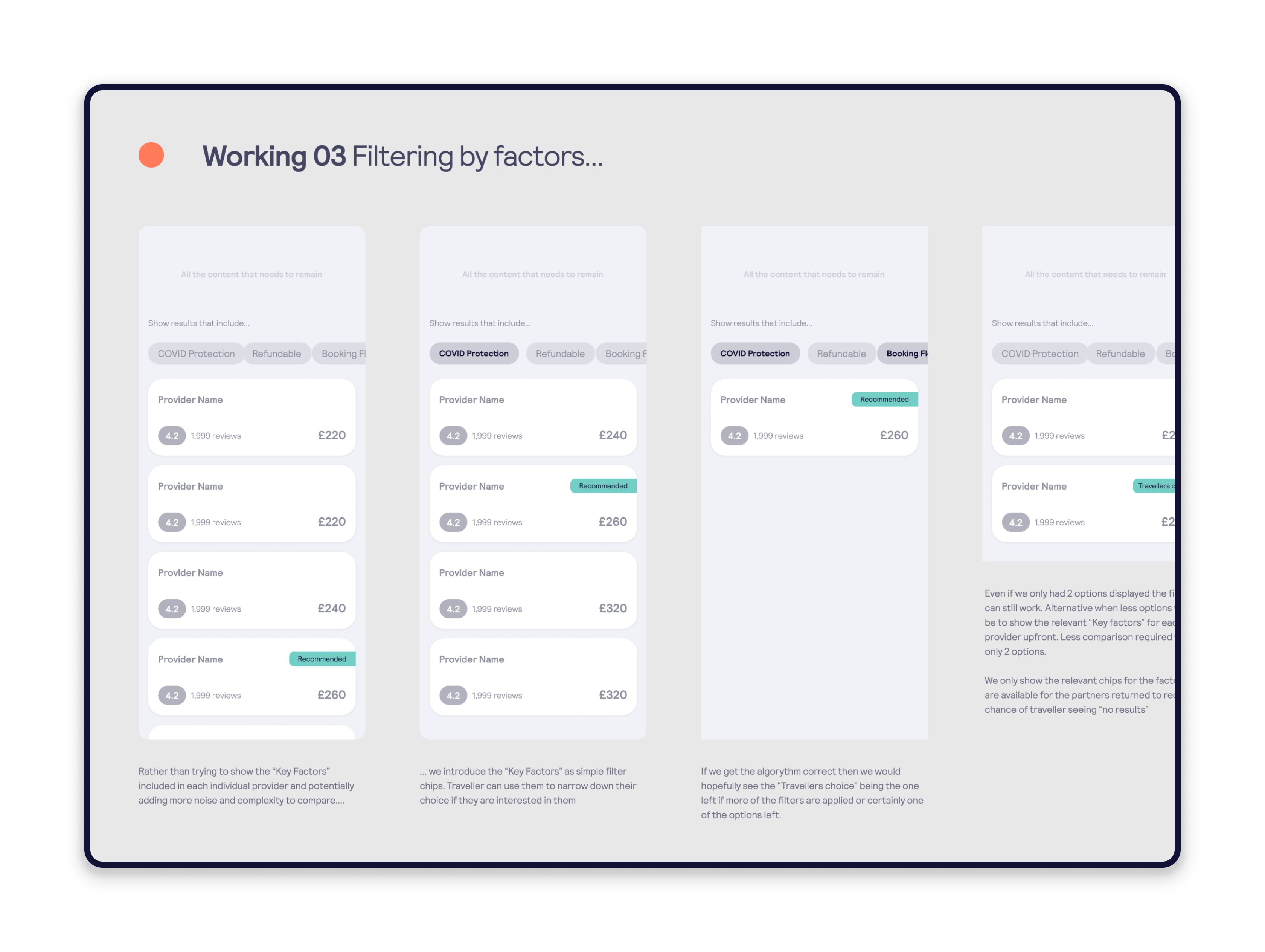
Curation - We wanted to demonstrate our coverage and show other options, but we wanted to reduce the cognitive load of showing so many options together.
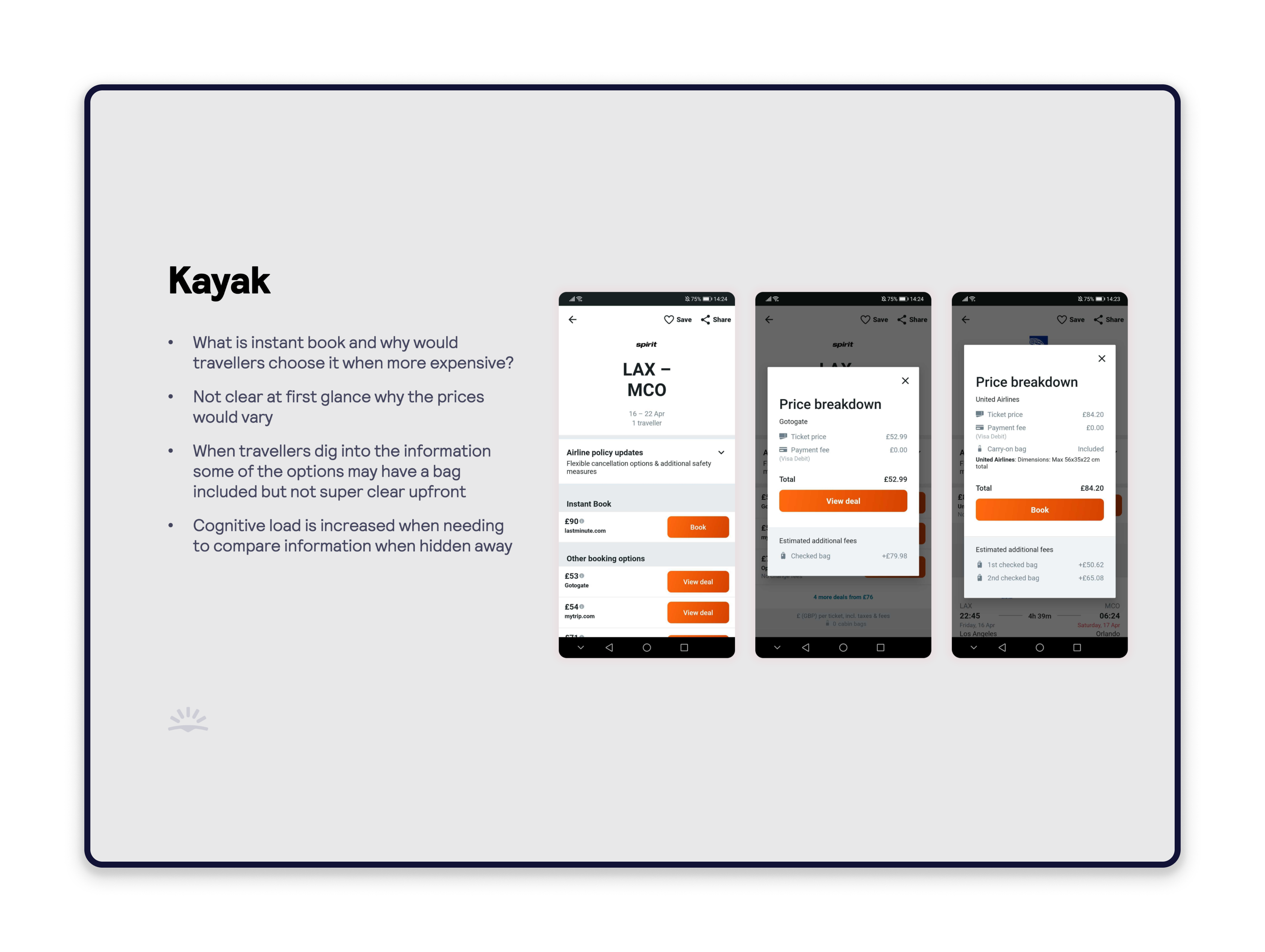
I started to look at competitors to see how they were tackling this problem. It became clear early on that no one was doing this well.

I began to explore different solutions for the education messages, were these going to be inline, tooltips, modals, banners, or loading screens? I considered whether to use social proof, traveler feedback, show ratings, scores, etc.


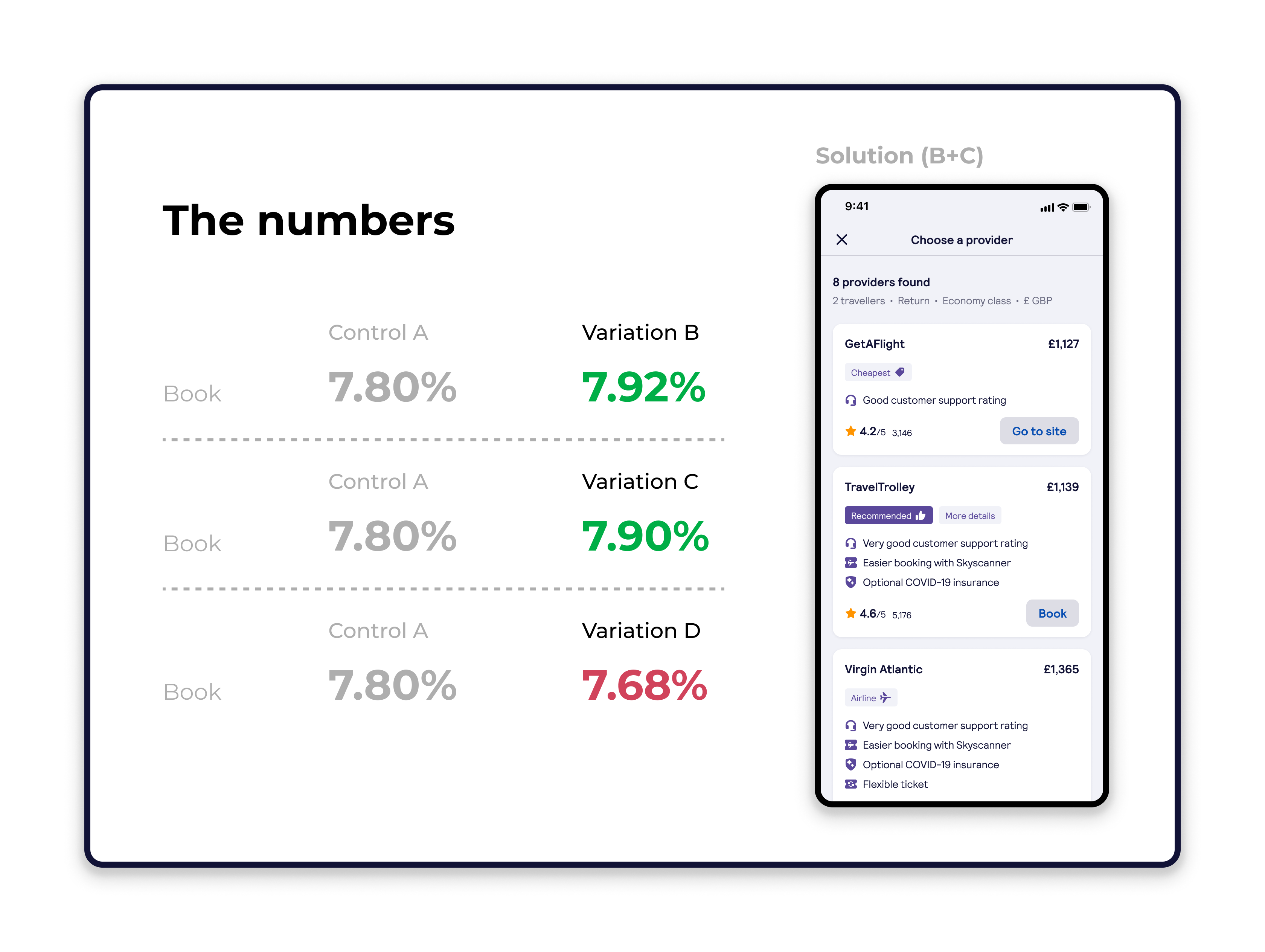
I conducted four rounds of moderated user testing to validate proposed solutions. The testing confirmed the effectiveness of the 'Our pick' label and the new option hierarchy, resulting in an overall positive reception. Key learning focused on refining copy for transparency and trust (to avoid the perception of sponsorship) and adjusting the UI to better expose the full range of options beyond the initial three.
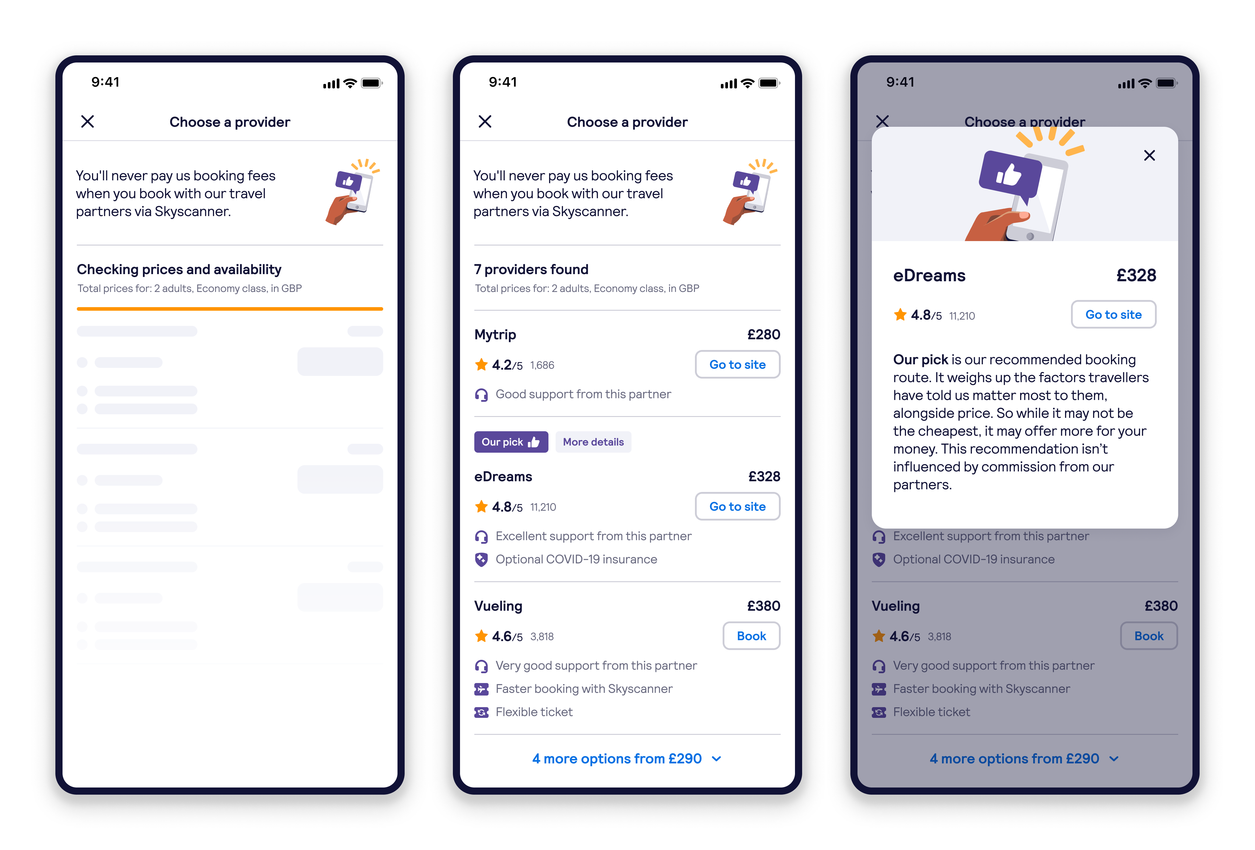
My solution, 'The Power of Three,' was designed to reduce cognitive load by simplifying choice. It surfaced the three most relevant options: the Recommended (our preferred option), the cheapest, and the primary airline. This allowed travellers to compare a trusted provider and the lowest price against our value-driven recommendation.
All provider options remained available on expansion. We used an educational modal for the Recommended option to ensure transparency, explaining that it was commission free and based purely on our key comparison factors.